Zoom, but you're driving
Zoom is designed for desktops and phones, environments where the user's full attention is available. A car is the opposite. The driver's primary task is driving. Any secondary interaction has to be minimal, glanceable, and safe at highway speeds.
The challenge was not simply porting Zoom to a new screen. It was rethinking what a meeting experience looks like when the user cannot look at the screen, cannot type, and cannot afford to be distracted.
Three stakeholders, one experience
This project sat at the intersection of three organizations, each with their own requirements. Zoom needed feature parity and brand consistency. Chery needed the experience to meet their vehicle safety standards and integrate with their infotainment platform. And as the design and development partner, Telenav needed to bridge both while delivering a product that worked within real automotive constraints.
Driving vs. parked
The most fundamental constraint: what the driver can access depends on whether the vehicle is moving. While driving, only audio controls are available. Video, participant views, and shared content are only accessible when parked. This single rule shaped the entire information architecture.
No keyboard, no mouse
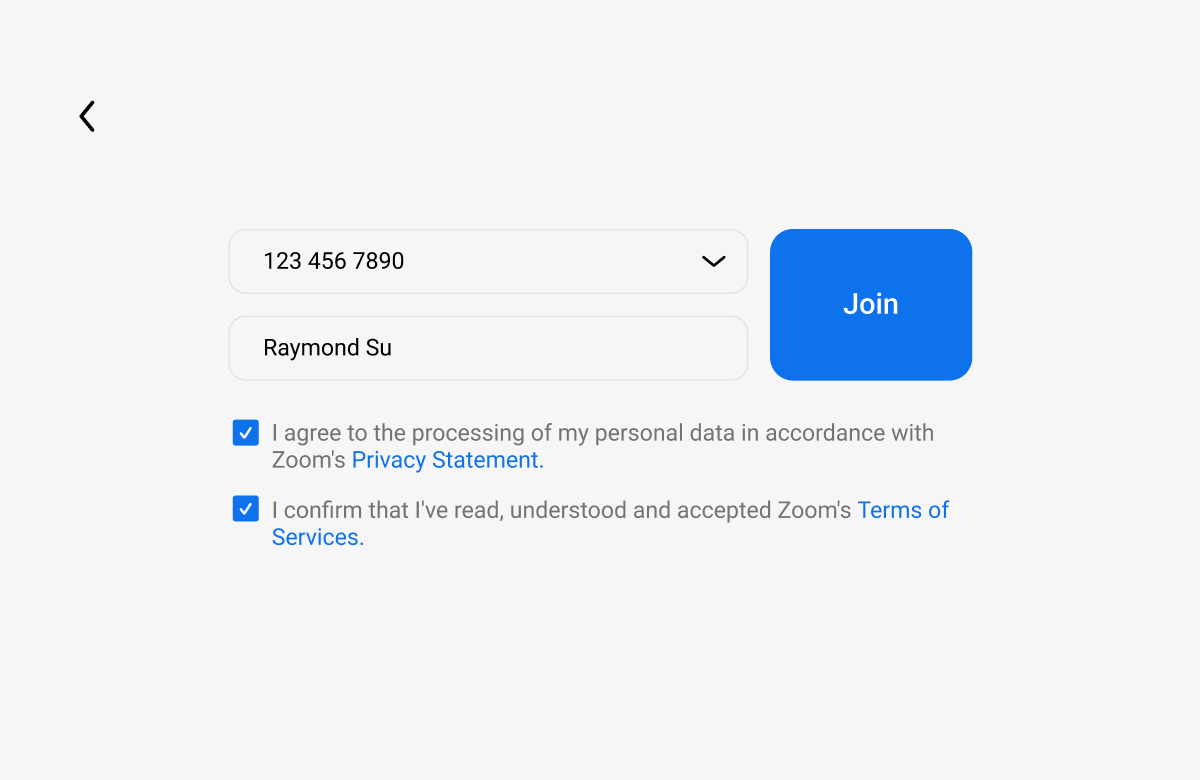
In-car interactions rely on voice, touch, and steering wheel controls. Every interaction had to be achievable with minimal taps and zero text input. Meeting IDs and credentials are stored locally so users can rejoin without re-entering information.
Glanceability
NHTSA guidelines recommend that any in-vehicle interaction take no more than two seconds of eyes-off-road time. Every screen, every control, every piece of information had to pass that test.
Adapting a desktop paradigm for the road
Zoom's interface assumes a user who can see a grid of faces, read chat messages, share their screen, and manage participants with fine motor control. None of that translates to a moving vehicle. The design challenge was deciding what to keep, what to simplify, and what to remove entirely.
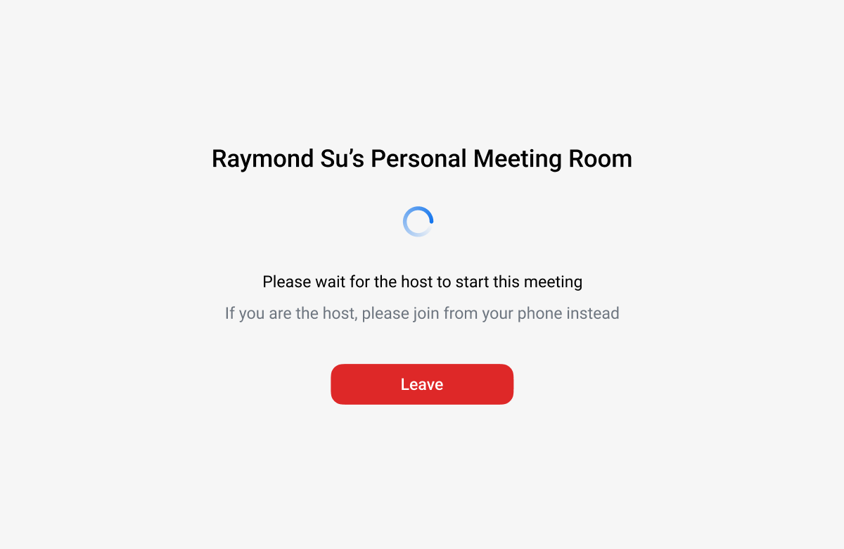
The core question: what does a driver actually need from a meeting while driving? The answer is surprisingly narrow. They need to join on time, hear everyone clearly, mute and unmute, and know when the meeting ends. Everything else is a parked experience.
"The Zoom app embedded in the Chery Digital Experience has audio access only while driving."
Zoom for Cars design principle
Two modes, one seamless experience
Rather than building one interface that tries to do everything, I designed two distinct modes that transition automatically based on vehicle state.
Driving mode: audio-first
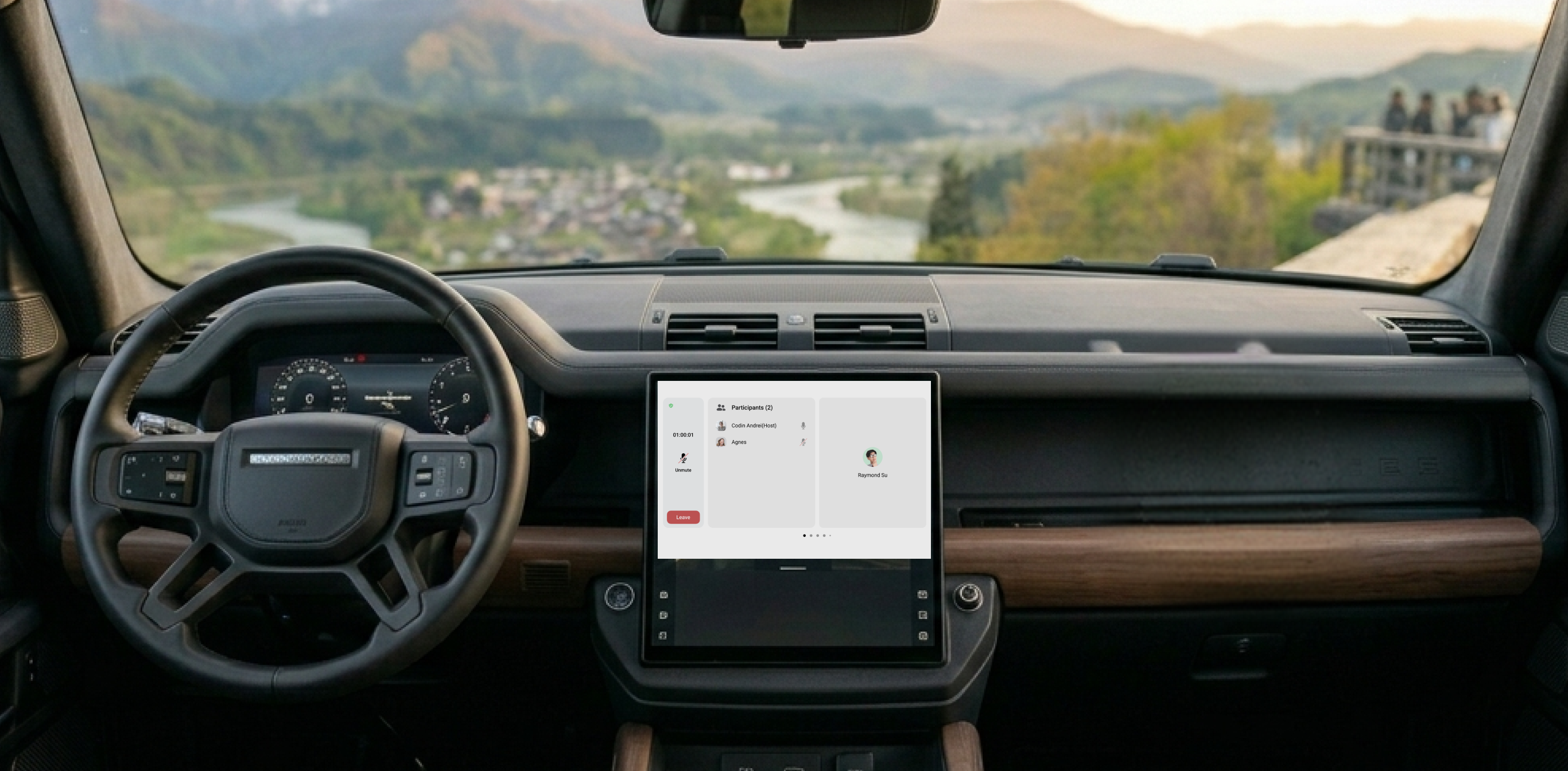
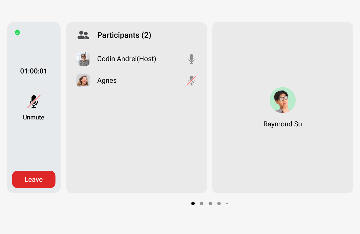
While the vehicle is in motion, the interface strips down to essentials: a minimal display showing meeting name, duration, and large touch targets for mute, leave, and raise hand. No video feeds, no participant lists, no shared content. The driver can join a scheduled meeting with a single tap and control it without looking away from the road.
Parked mode: full experience
When the vehicle is parked, the full meeting interface becomes available. Participants' video feeds appear on the center display. Shared content is viewable. The experience feels closer to Zoom on a tablet, adapted for the car's screen size and touch interaction patterns.
Seamless transition
The transition between modes happens automatically based on vehicle state. If a driver pulls over during a call, video fades in. If they start driving, it gracefully drops to audio-only. No manual switching, no interruption to the meeting.
Pre-meeting experience
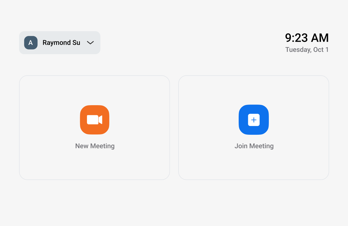
Upcoming meetings are surfaced from the user's calendar, displayed with one-tap join. The system stores meeting credentials locally, so returning users can join without re-entering IDs or passwords. For drivers who commute at the same time each day, joining their morning standup becomes a single tap.
How I approached it
As the sole UX designer, I owned the full interaction design from initial concept through production-ready specifications. The process followed a similar pattern to other IVI projects I had worked on at Telenav: start with the constraints, design within them, and document thoroughly for the remote engineering team.
Audit the desktop experience
I started by mapping every feature and interaction in the desktop and mobile Zoom apps, then categorized each one: essential while driving, useful when parked, or not applicable in a vehicle.
Define the two-mode architecture
The driving vs. parked distinction became the foundation. I designed the information architecture, interaction flows, and state management around this single principle.
Design within NHTSA guidelines
Every screen was evaluated against automotive safety standards: touch target sizes, information density, glance time. Controls were sized and positioned for real driving ergonomics.
Document for remote engineering
Detailed specifications were produced for each screen, state, and transition, following the same documentation discipline I had developed on the Ford navigation project. The engineering team needed specs thorough enough to build from without ambiguity.