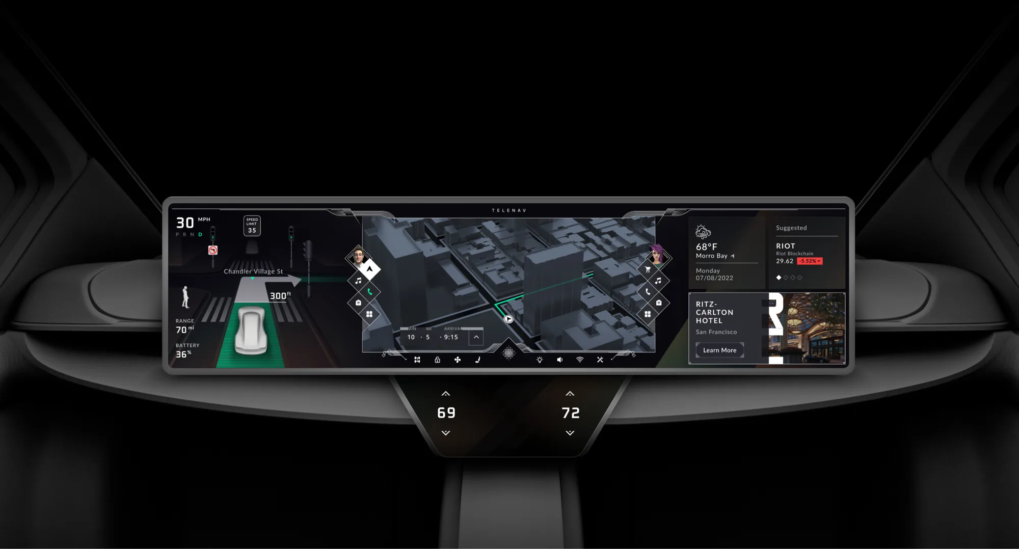
One pitch to define the cockpit
Stellantis was deciding who would shape the next generation of its in-car experience. We had one opportunity to make the case. Fitting everything on one edge-to-edge screen was the easy part. Keeping it calm instead of crowded was the real work.
We were a team of five designers: a voice and conversation designer, a UI designer, a lead UI designer, a design manager and me. I did the reach study and owned the foundations: the interaction flows, the UX and the low-fidelity wireframes, before our UI designer and cartographer finished the UI and styling. I also did some of the motion design, copy and visual mockups, helped build the pitch presentation, and set the groundwork for how the map looks.
Ultrawide canvas in the car
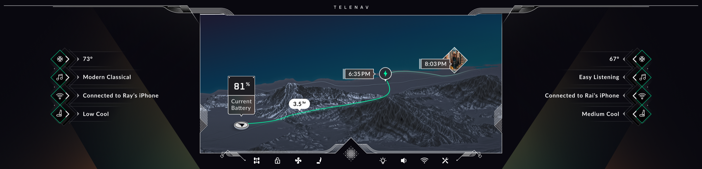
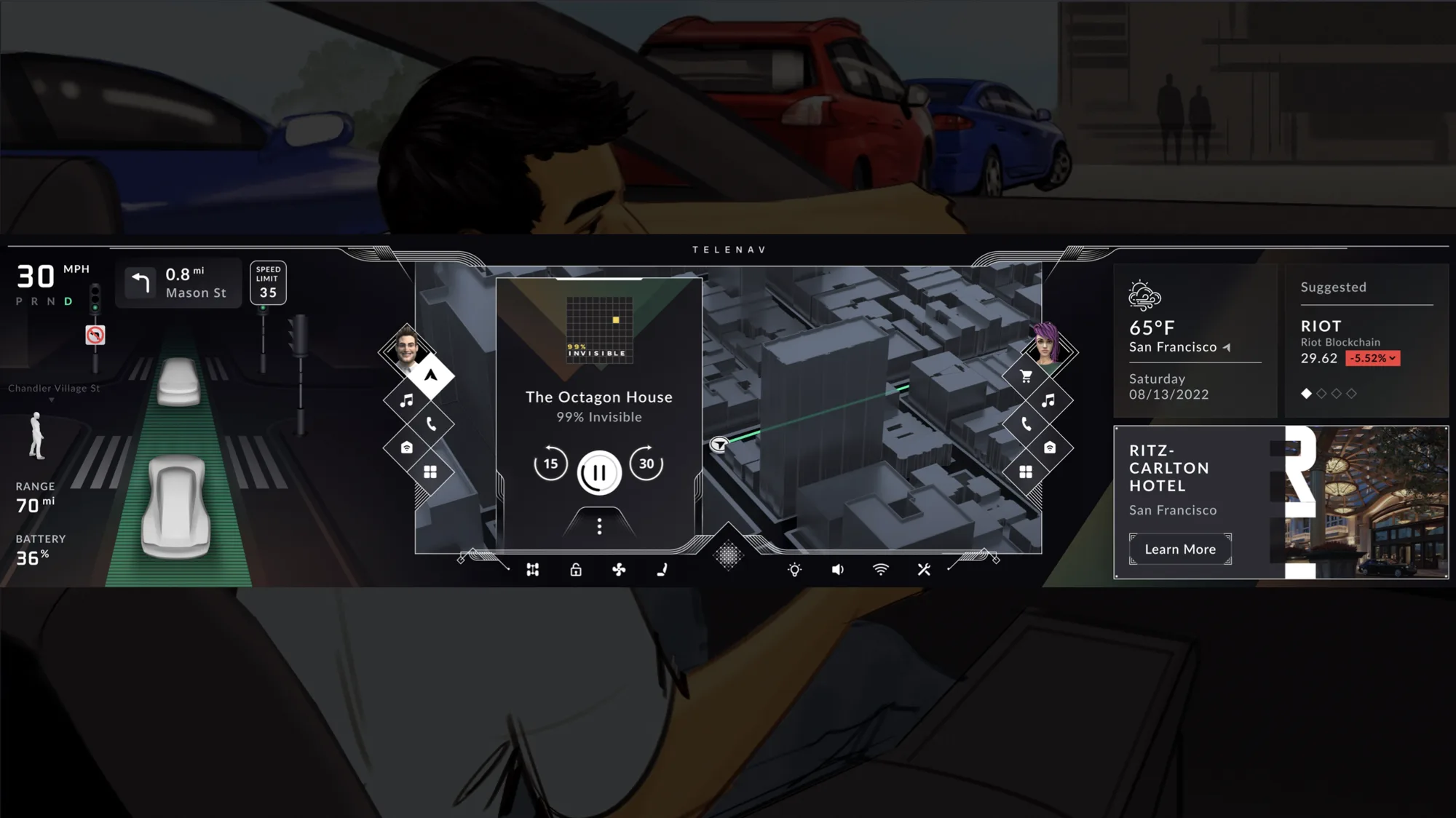
The canvas was a 3840 by 720 display running pillar to pillar across the dashboard, the widest screen a car has offered. That scale was the opportunity and the problem at once. Three constraints shaped every decision.
A screen too big to treat like a screen
At pillar-to-pillar width, no one can physically reach across the display, and scattering apps across it just reads as clutter. Occupants needed a structure they could read at a glance.
Two people, one surface
Driver and passenger share the same glass but want different things at the same time. Each needed their own space, controls, and audio, without splitting into two separate systems.
It is still a car
Everything on screen competes with the driver's attention. Driving-critical information had to stay glanceable, anchored where the driver already looks.
Turn a screen into a system
The hardest constraint, safety, turned out to be the answer. I started from what the driver can actually reach and glance at, and let that define the zones. Ergonomics first, which made this an information architecture problem before a visual one.
Let safety define the structure, and the rest can be flexible.
The principle behind the cockpit
A system built from the driver outward
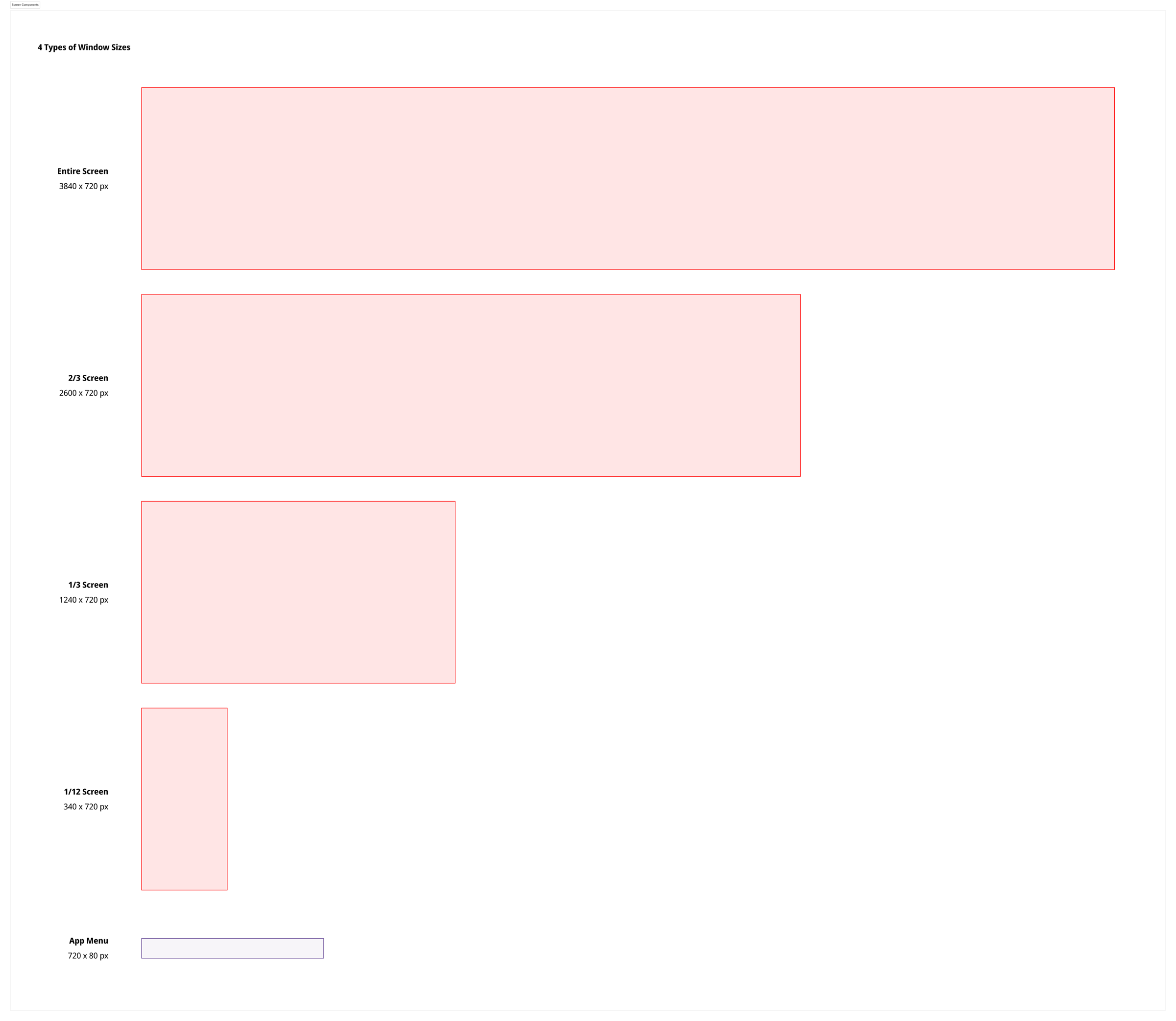
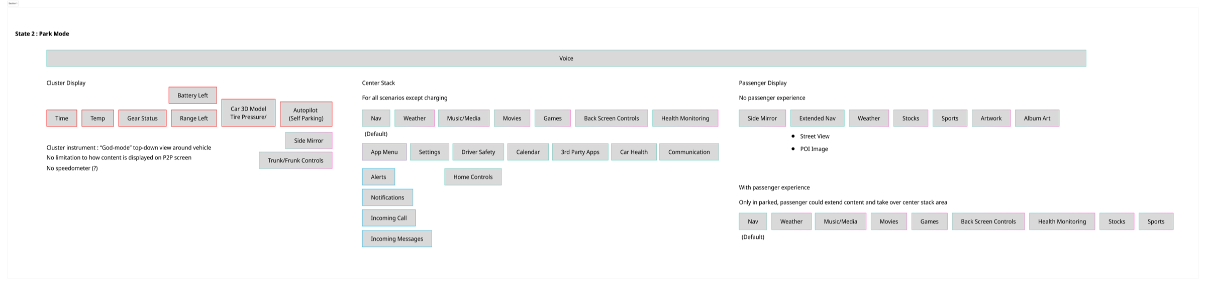
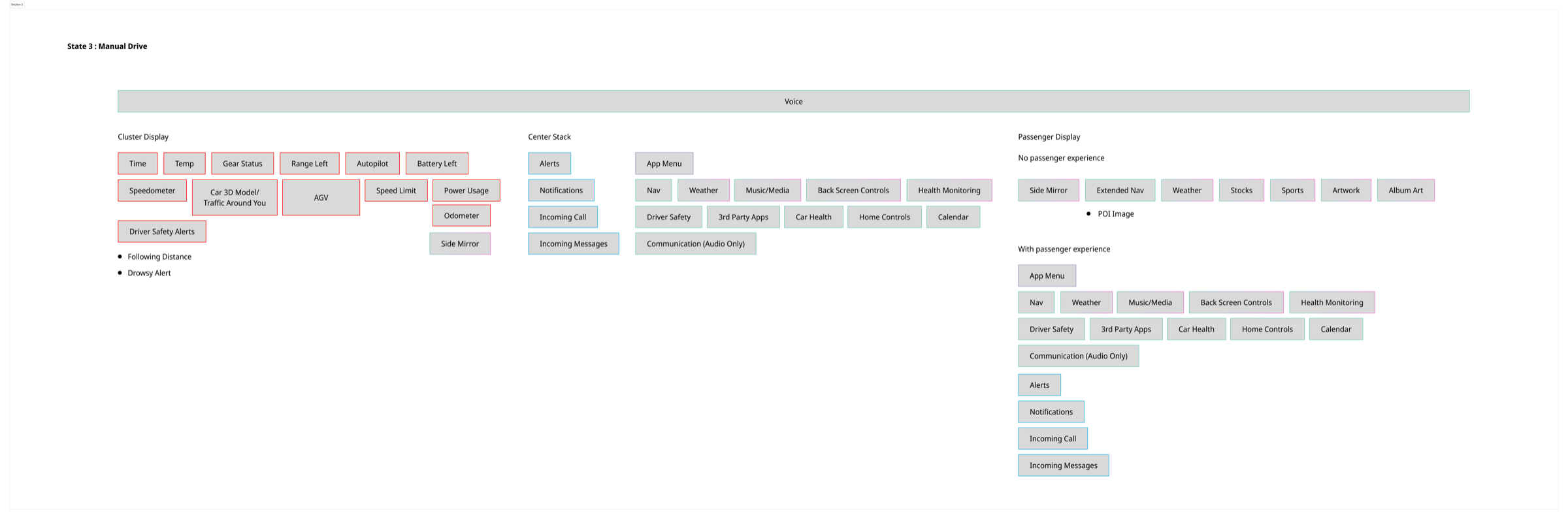
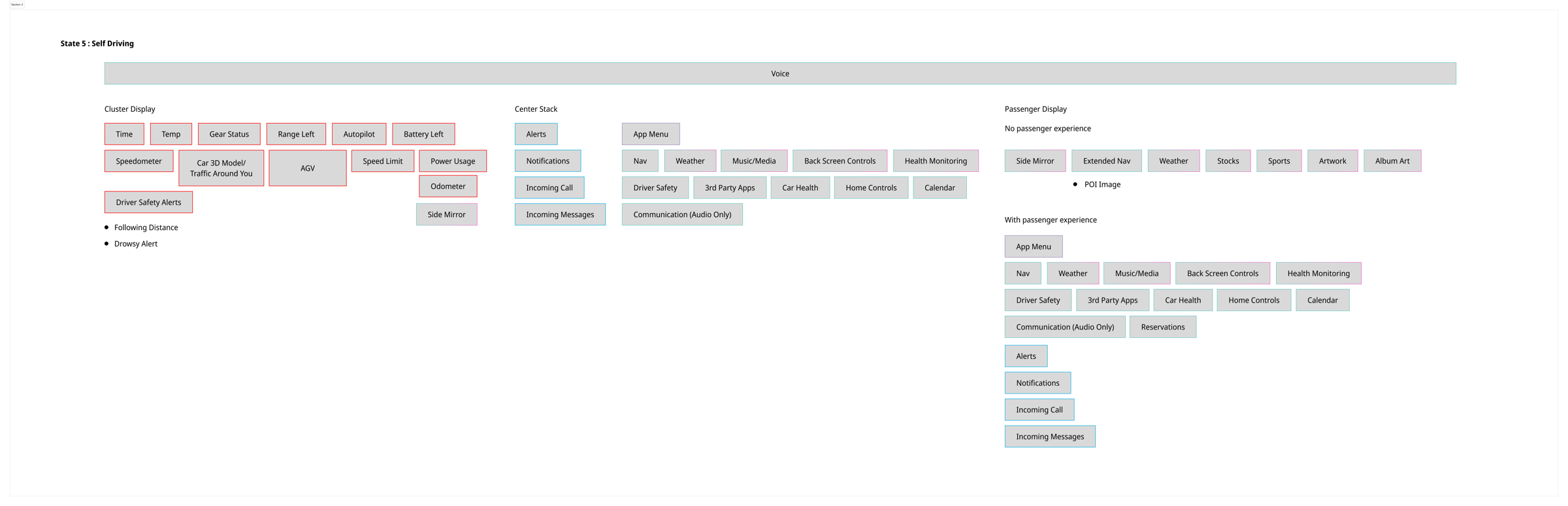
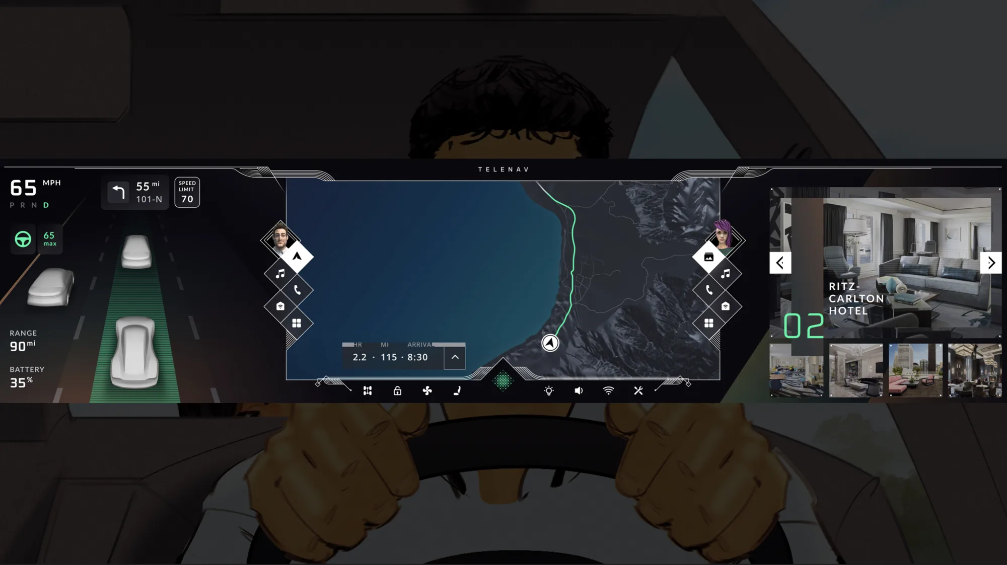
With the reach study as the foundation, the architecture is a handful of rules. The canvas divides into zones by function and by who they serve. Windows layer in a fixed priority, so urgent alerts always surface on top. Every element snaps to one of four sizes. And every function maps to a region for each vehicle state: parked, driving, or driving itself. These rules let a screen this large stay calm while it recomposes around the drive.

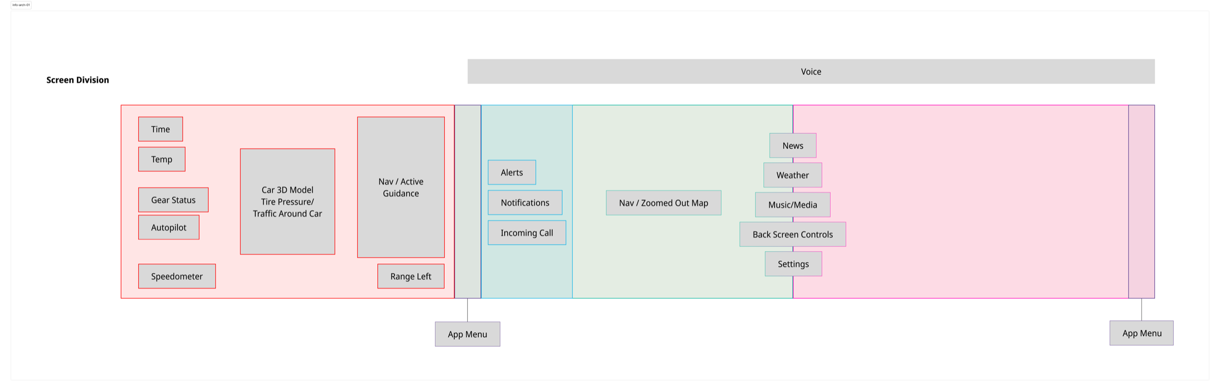
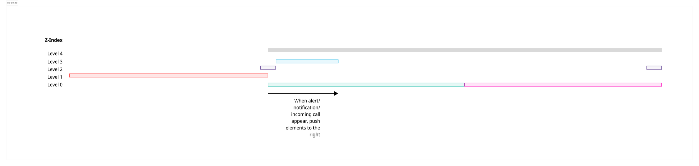
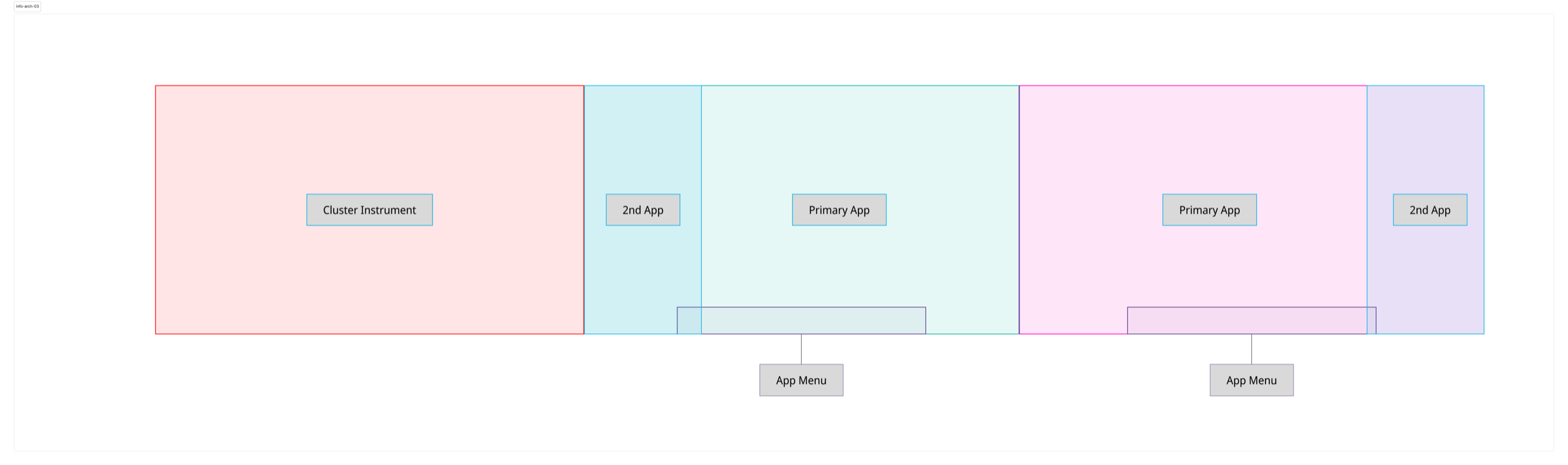
Giving every app a home zone wasn't enough on a screen this wide. People needed to move apps within reach, and the driver and passenger needed to hand apps to each other. So each side got an app menu within reach: a control hub to pull any app back, or pass it across.
The end-to-end driver experience
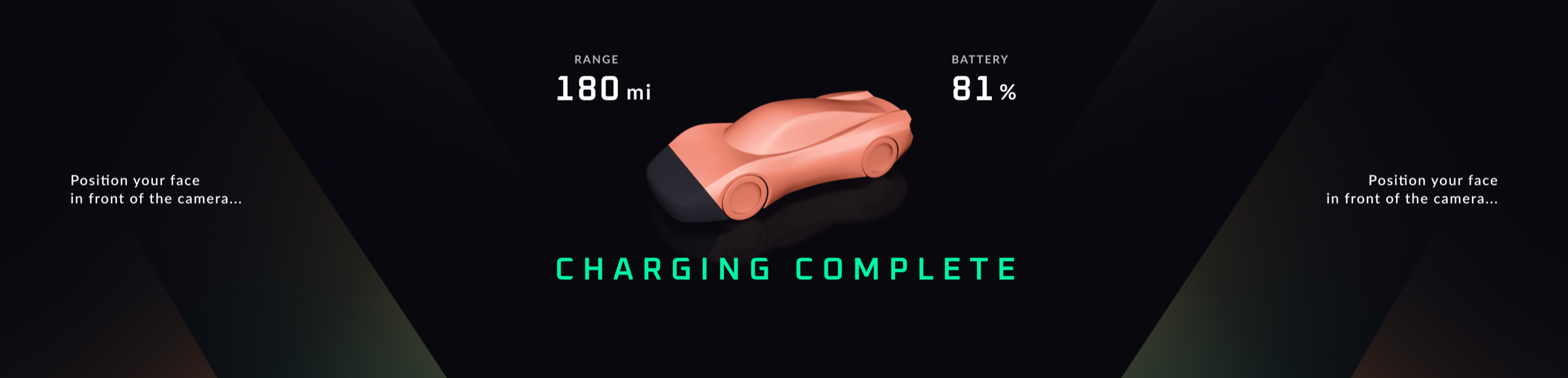
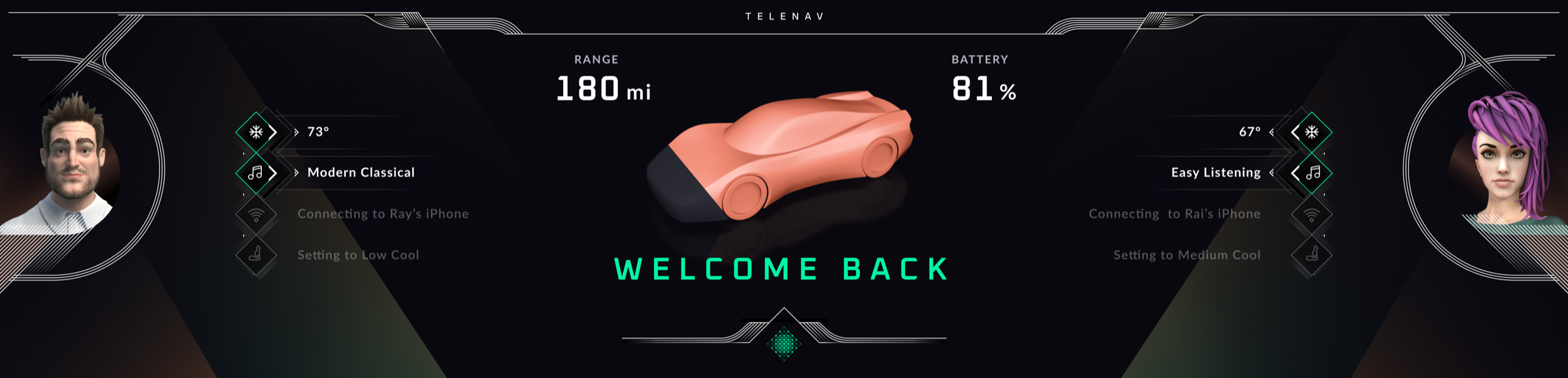
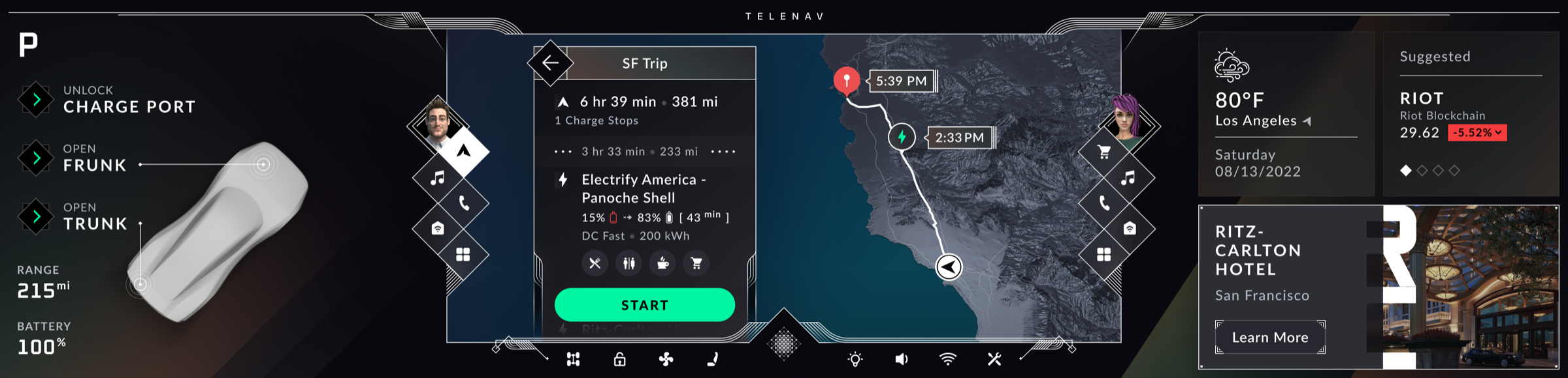
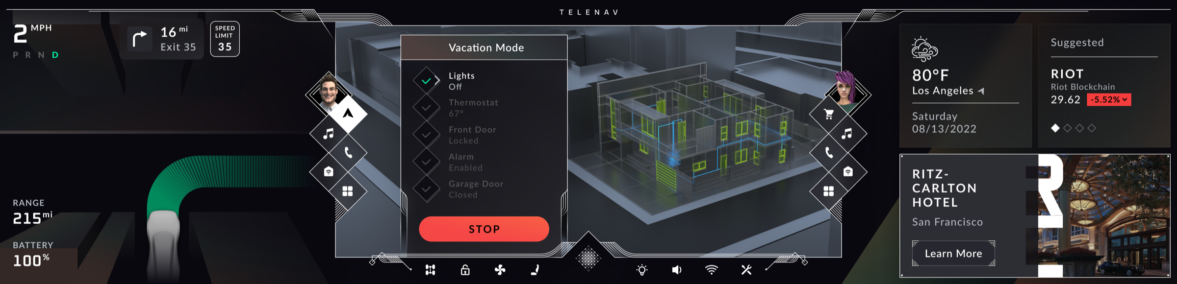
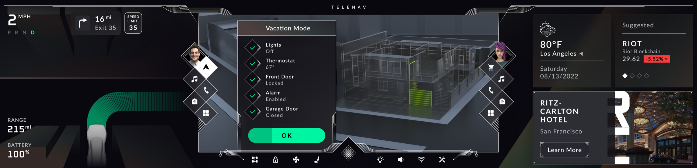
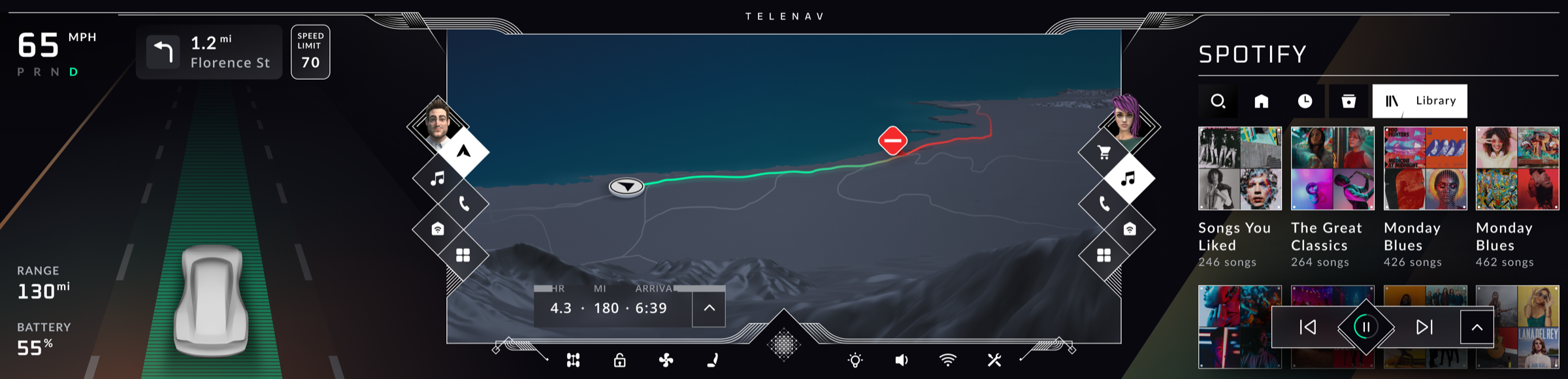
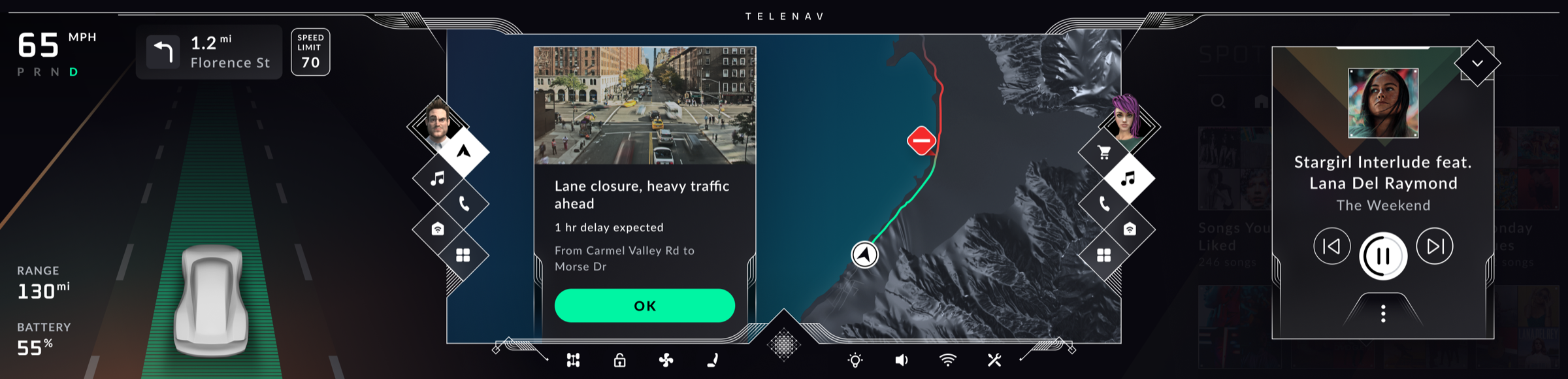
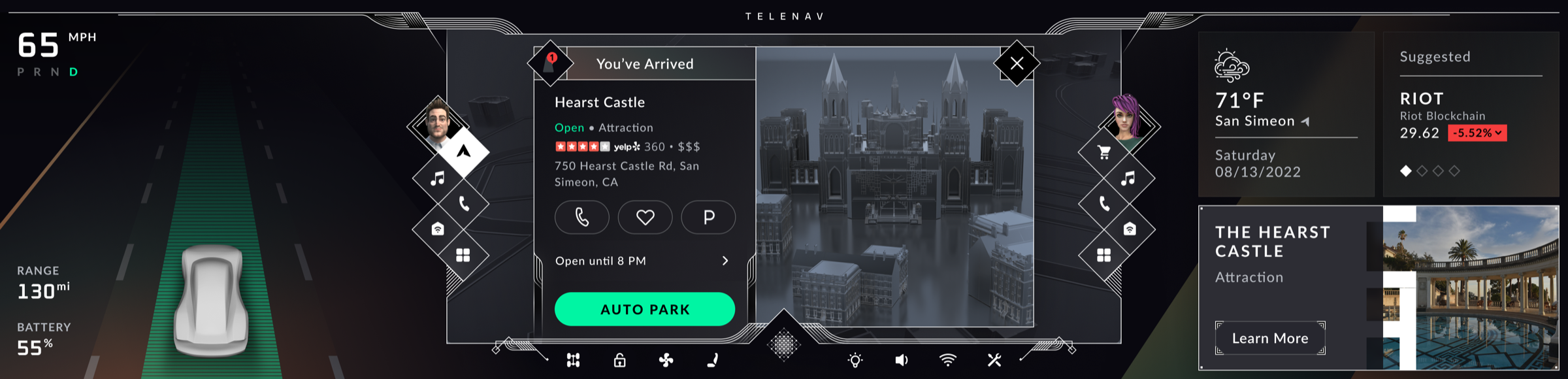
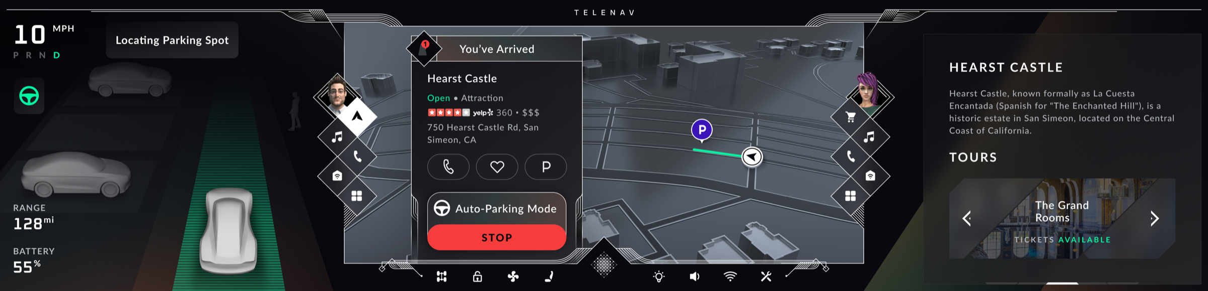
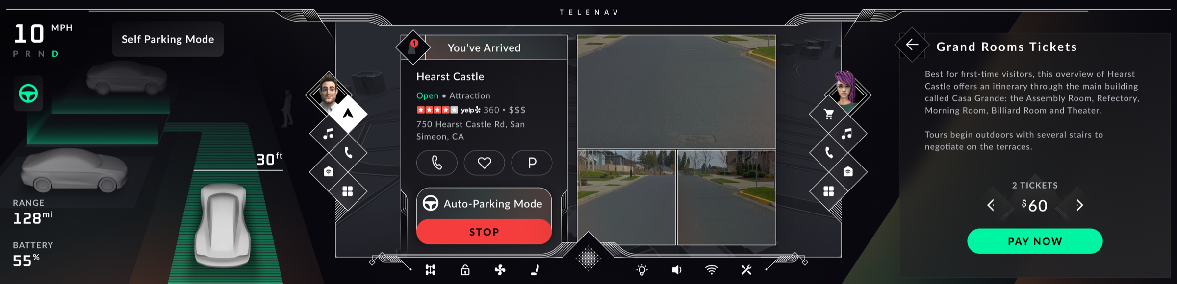
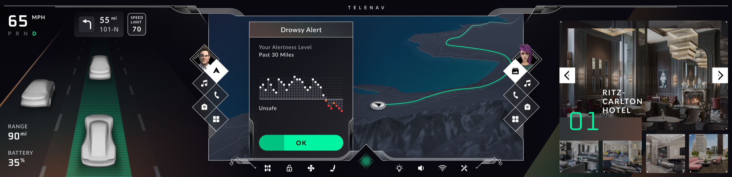
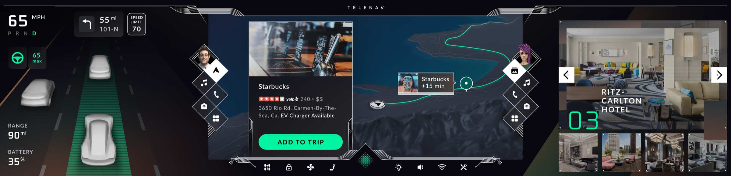
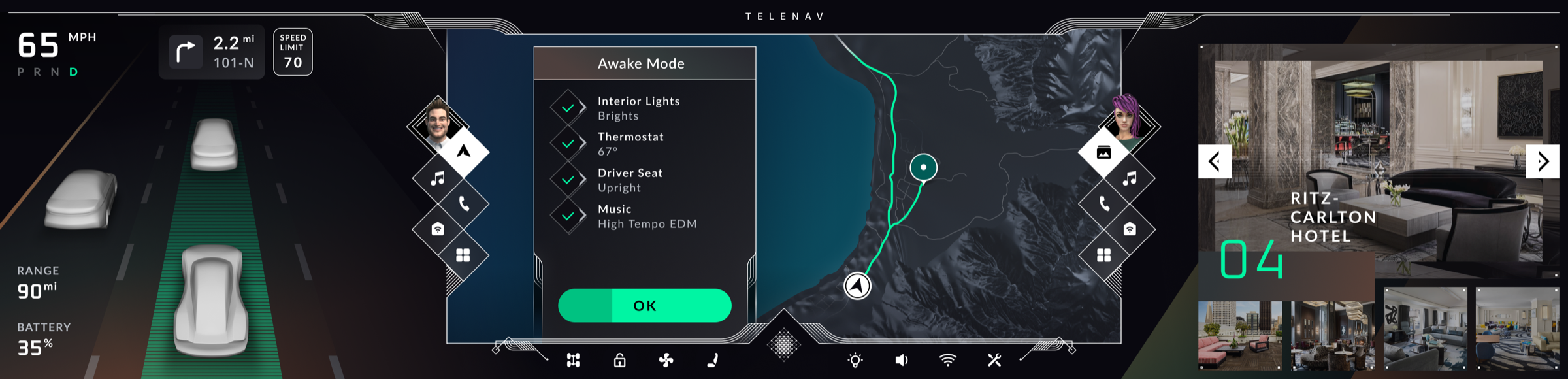
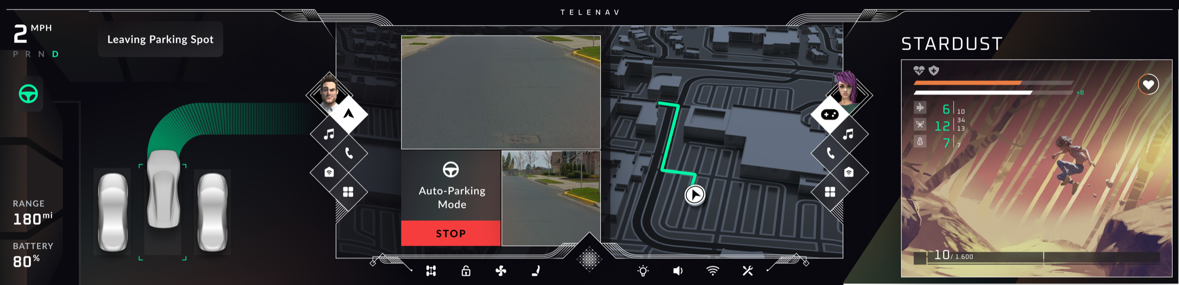
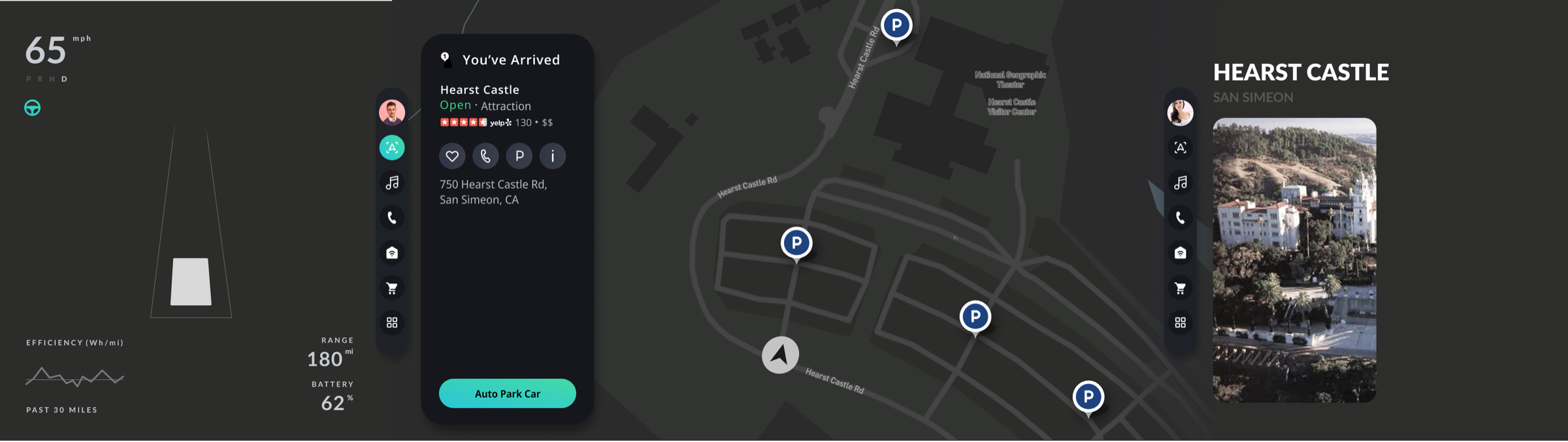
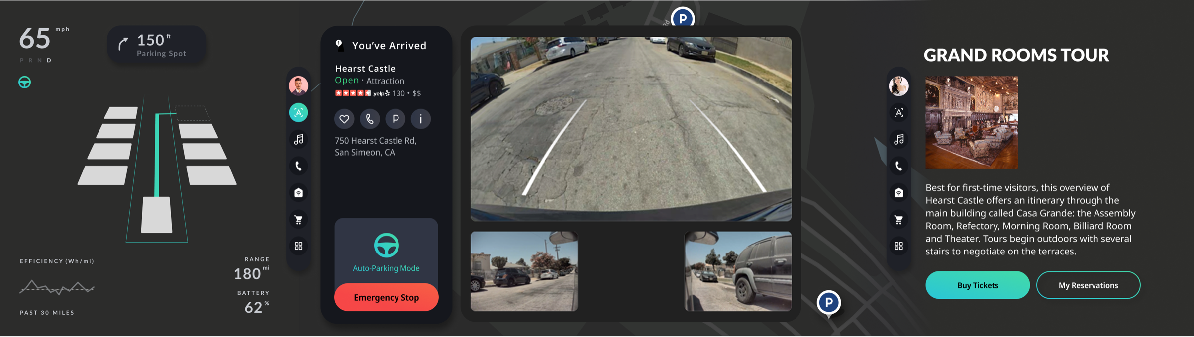
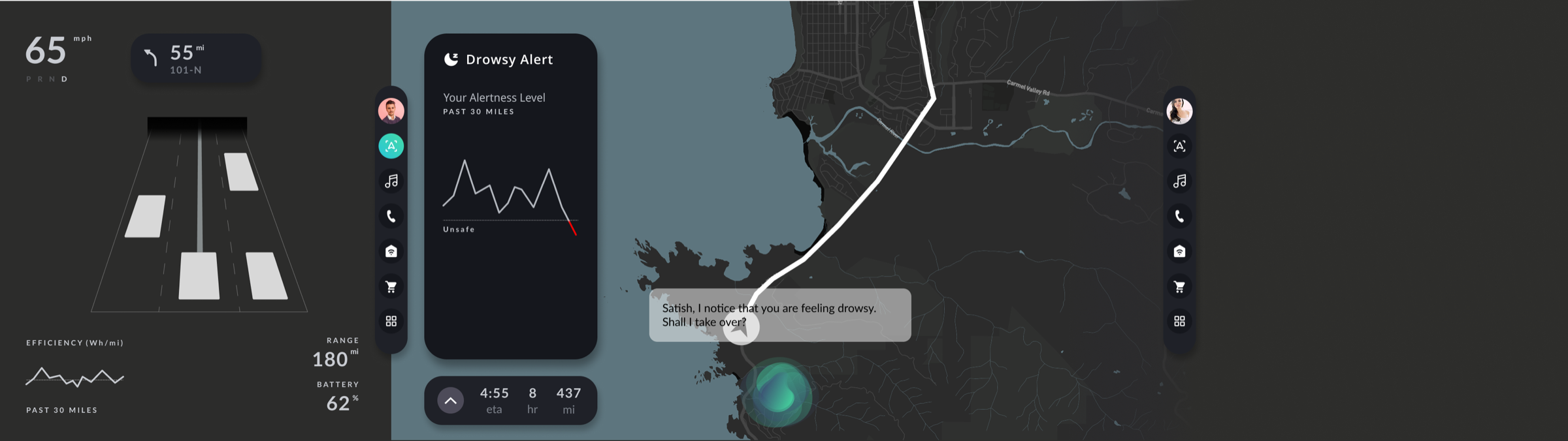
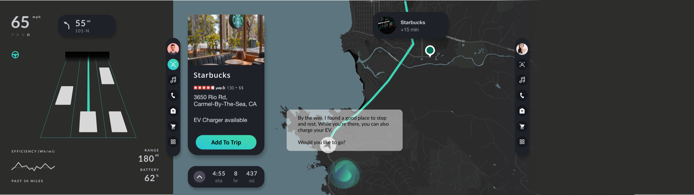
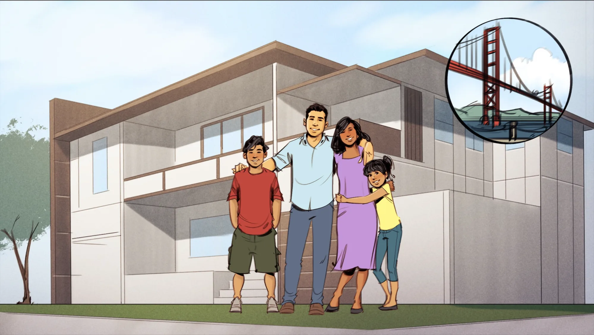
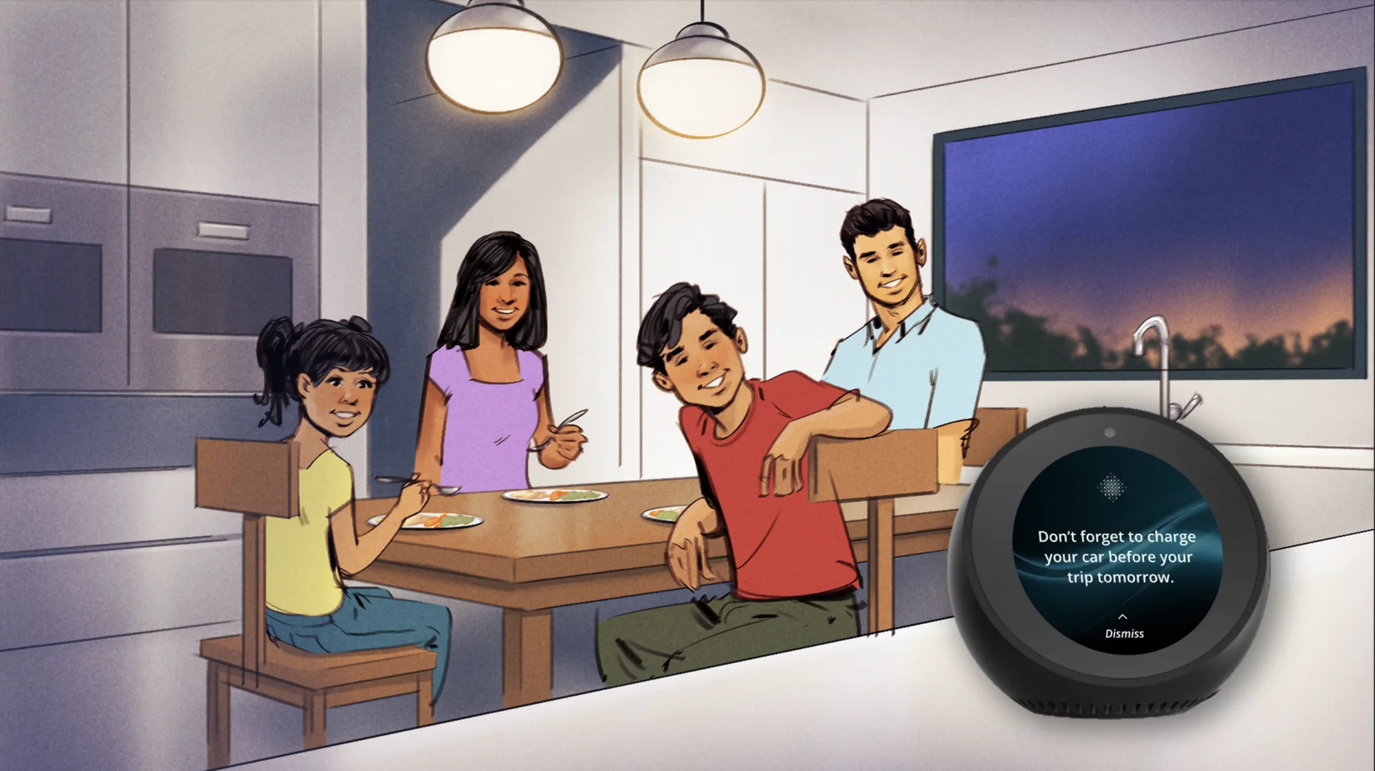
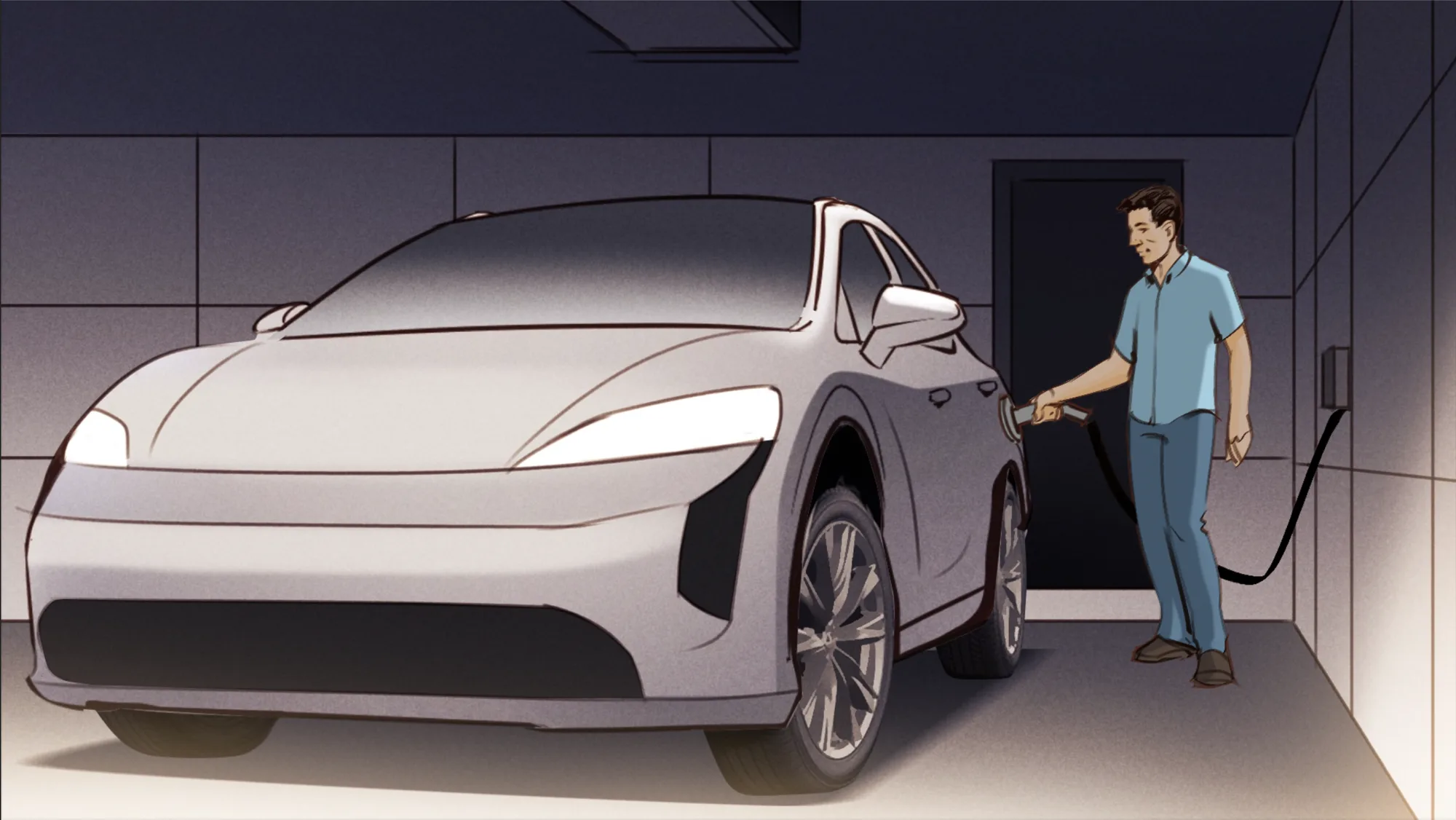
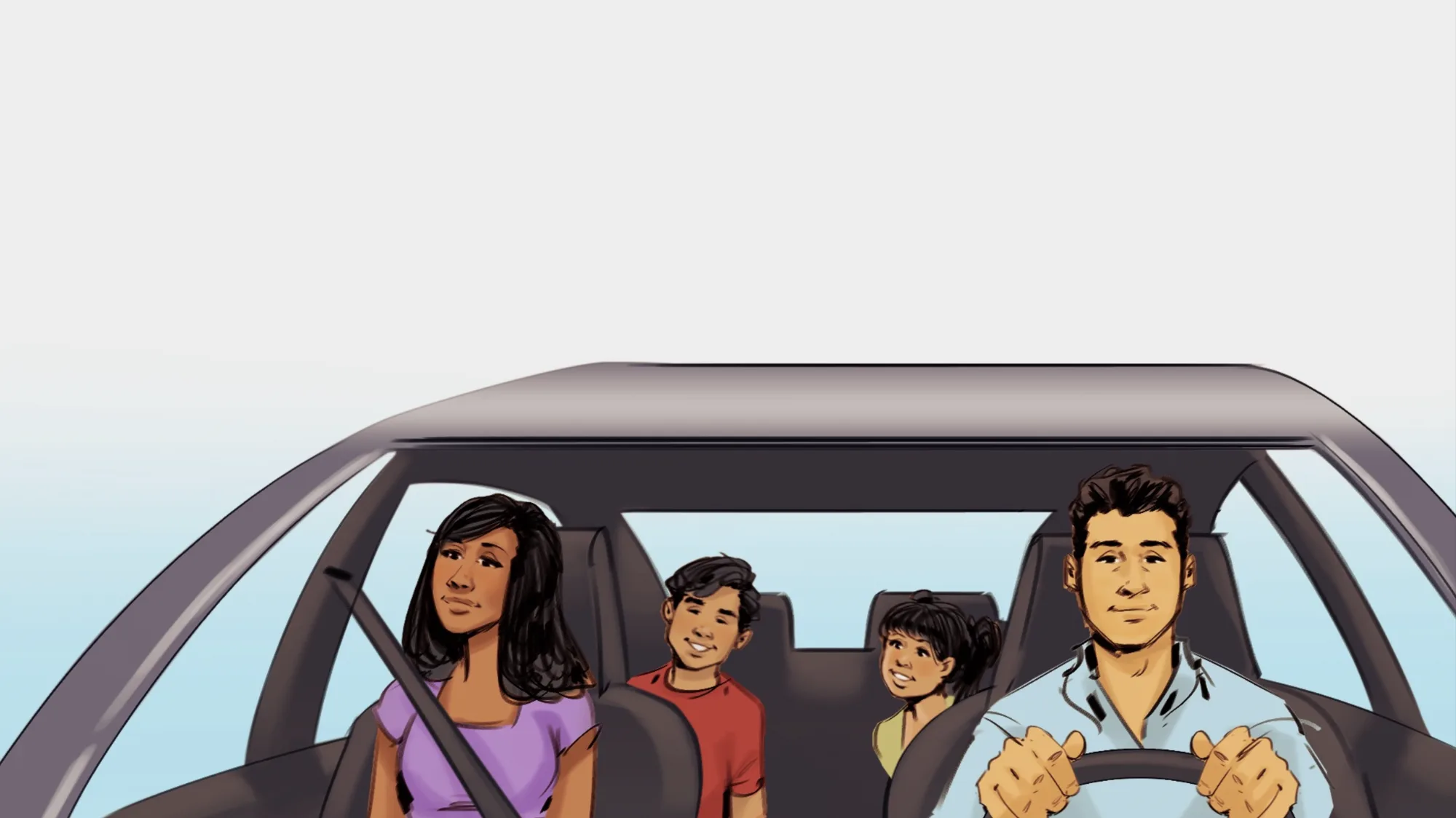
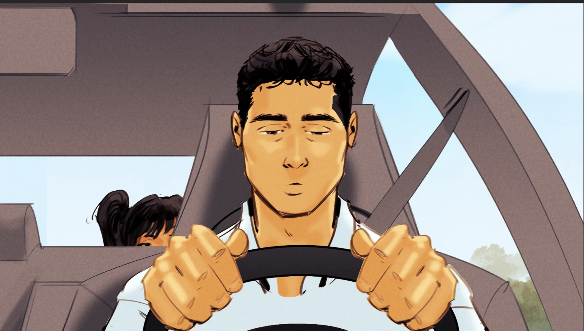
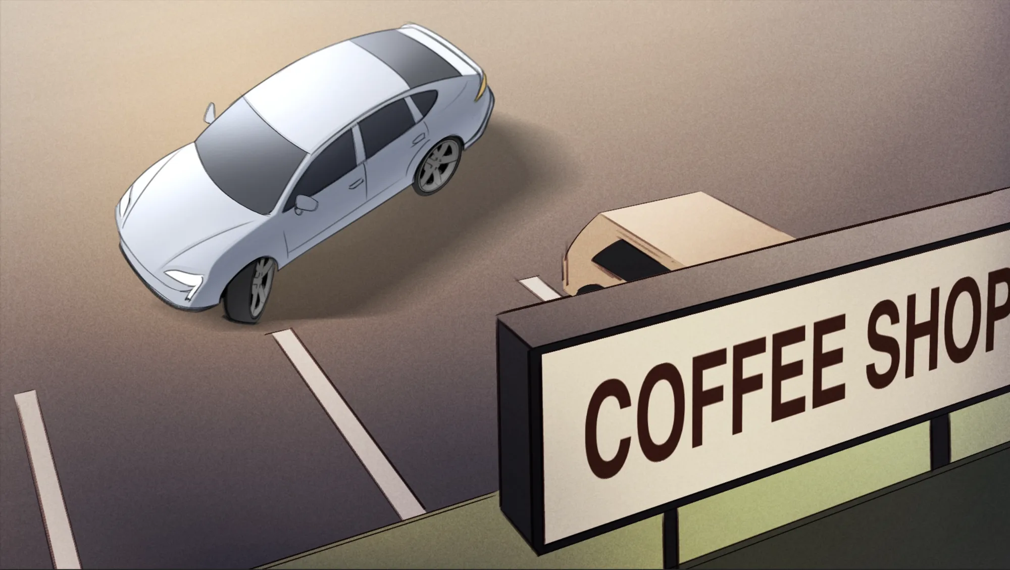
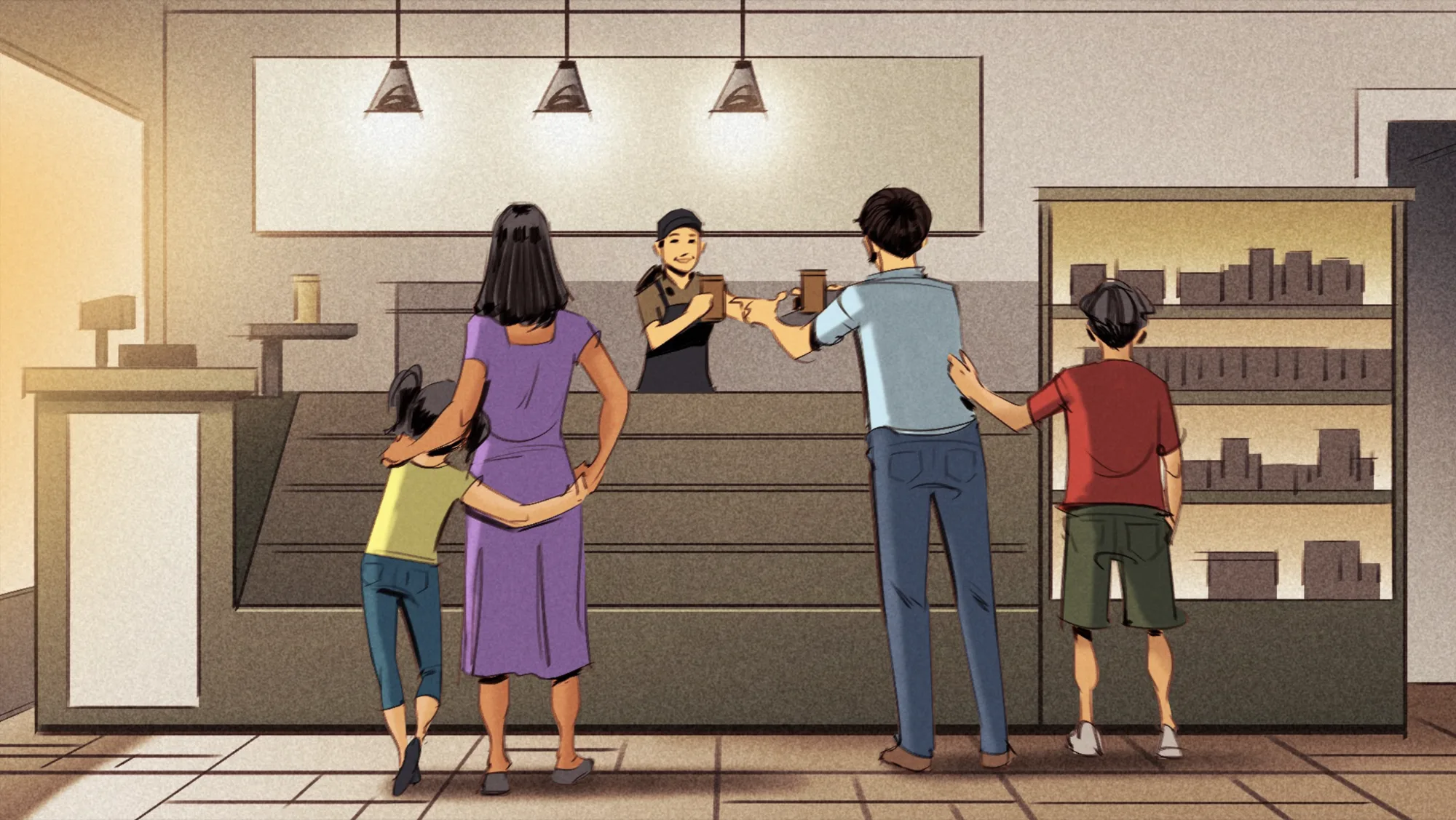
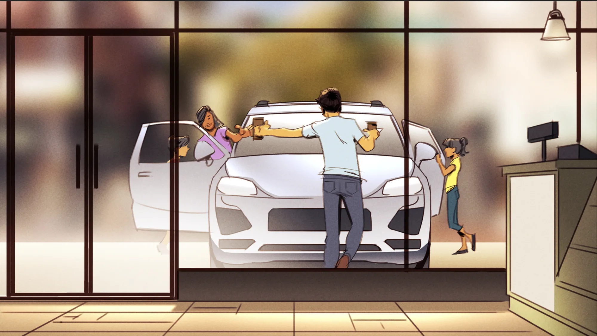
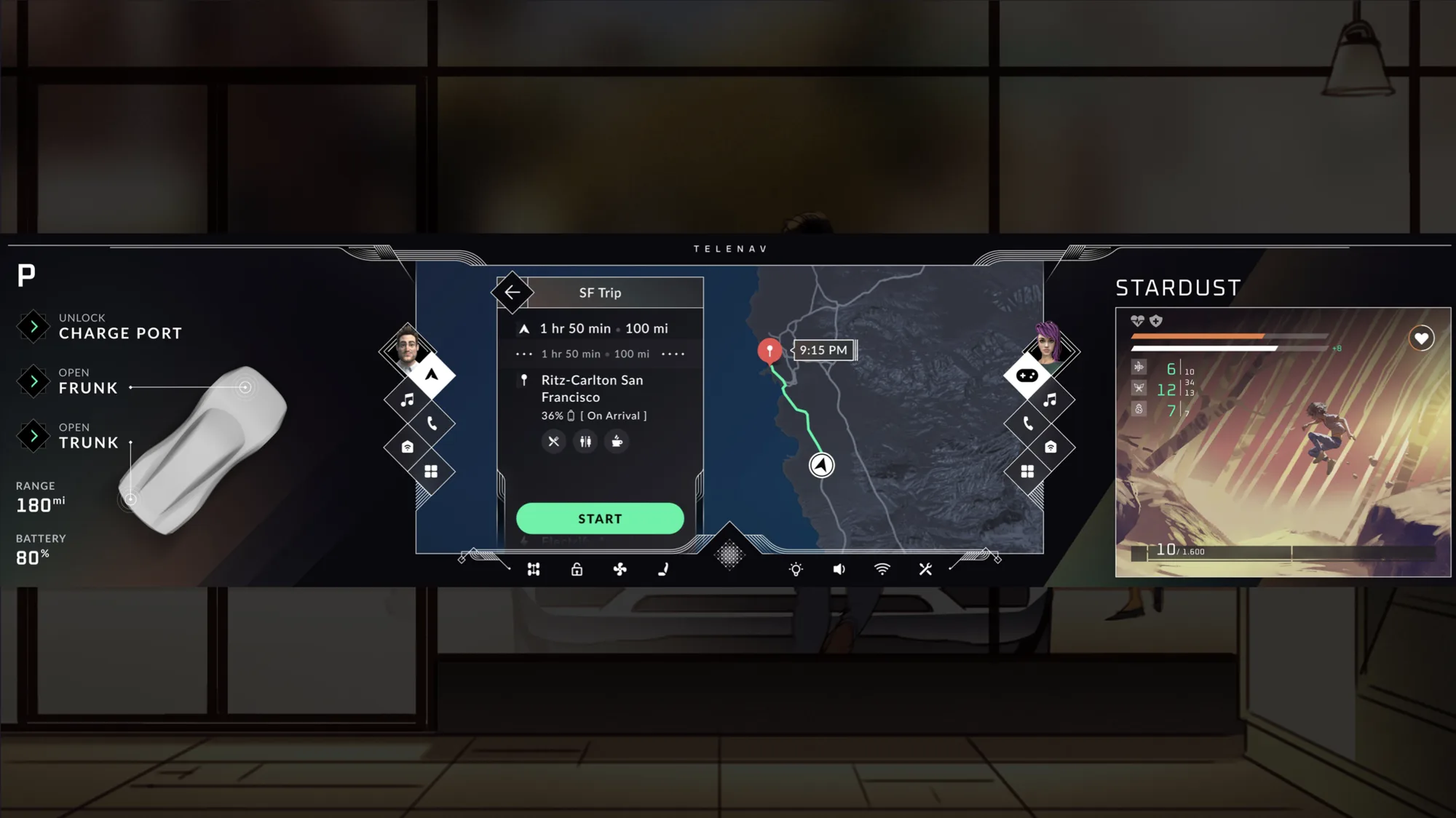
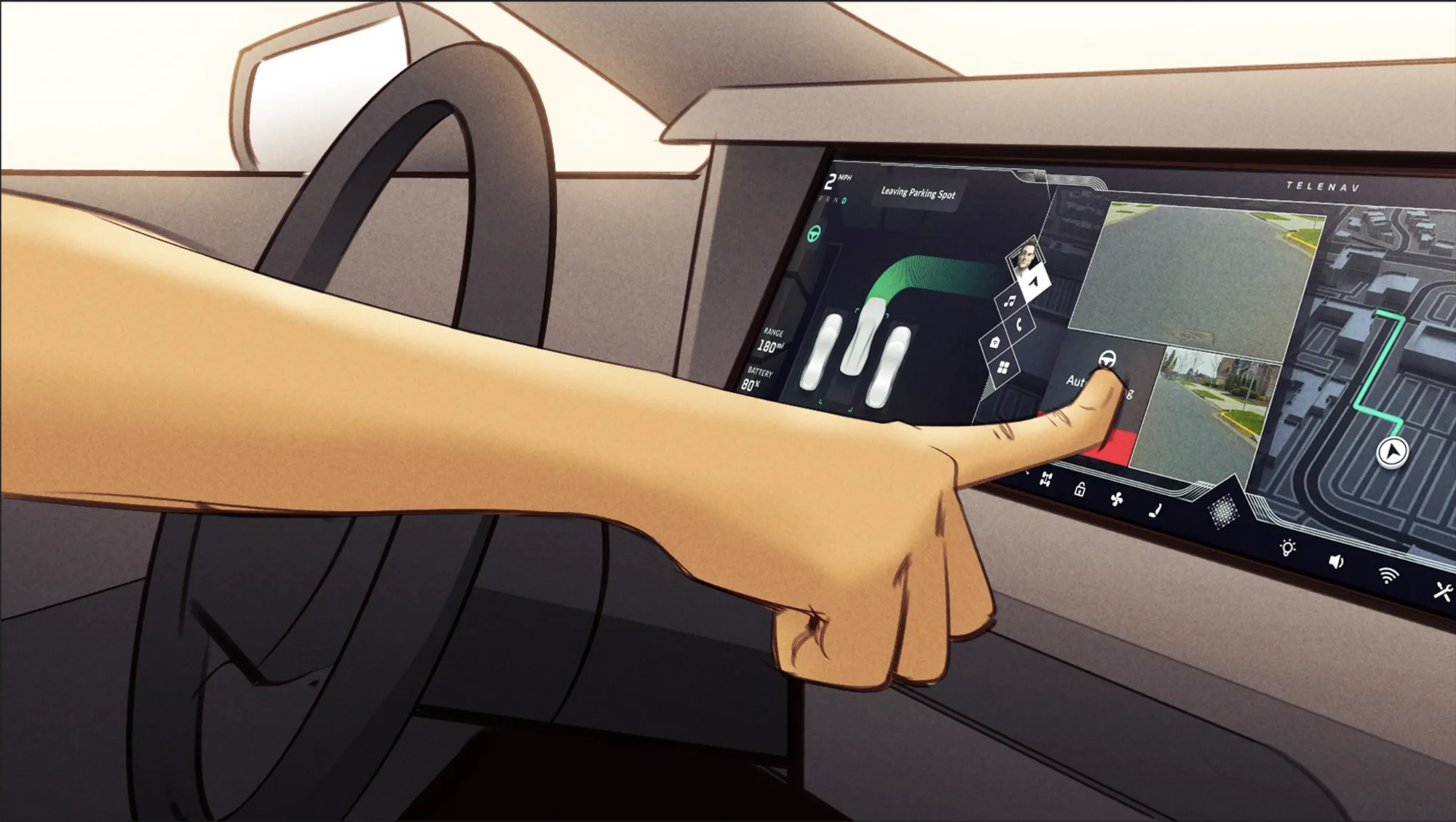
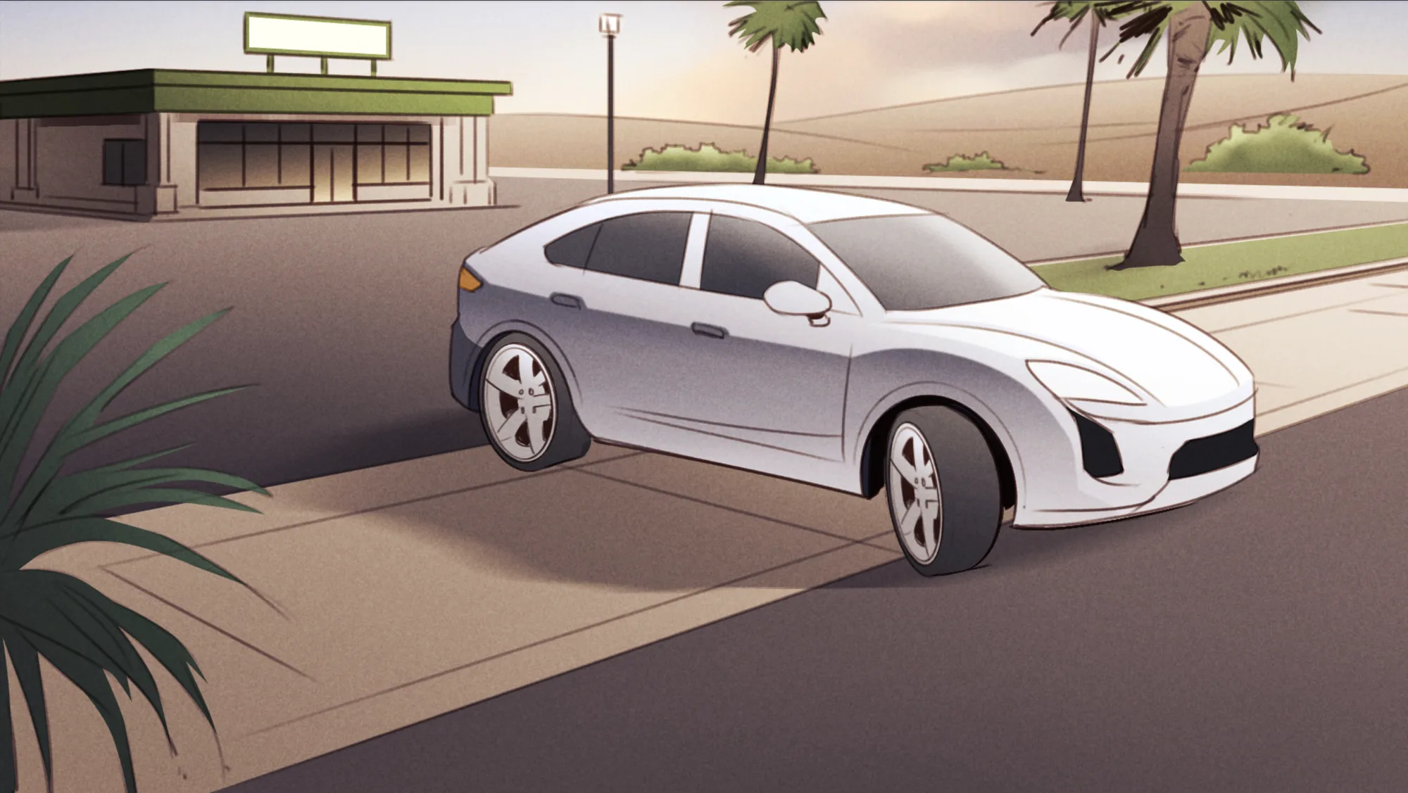
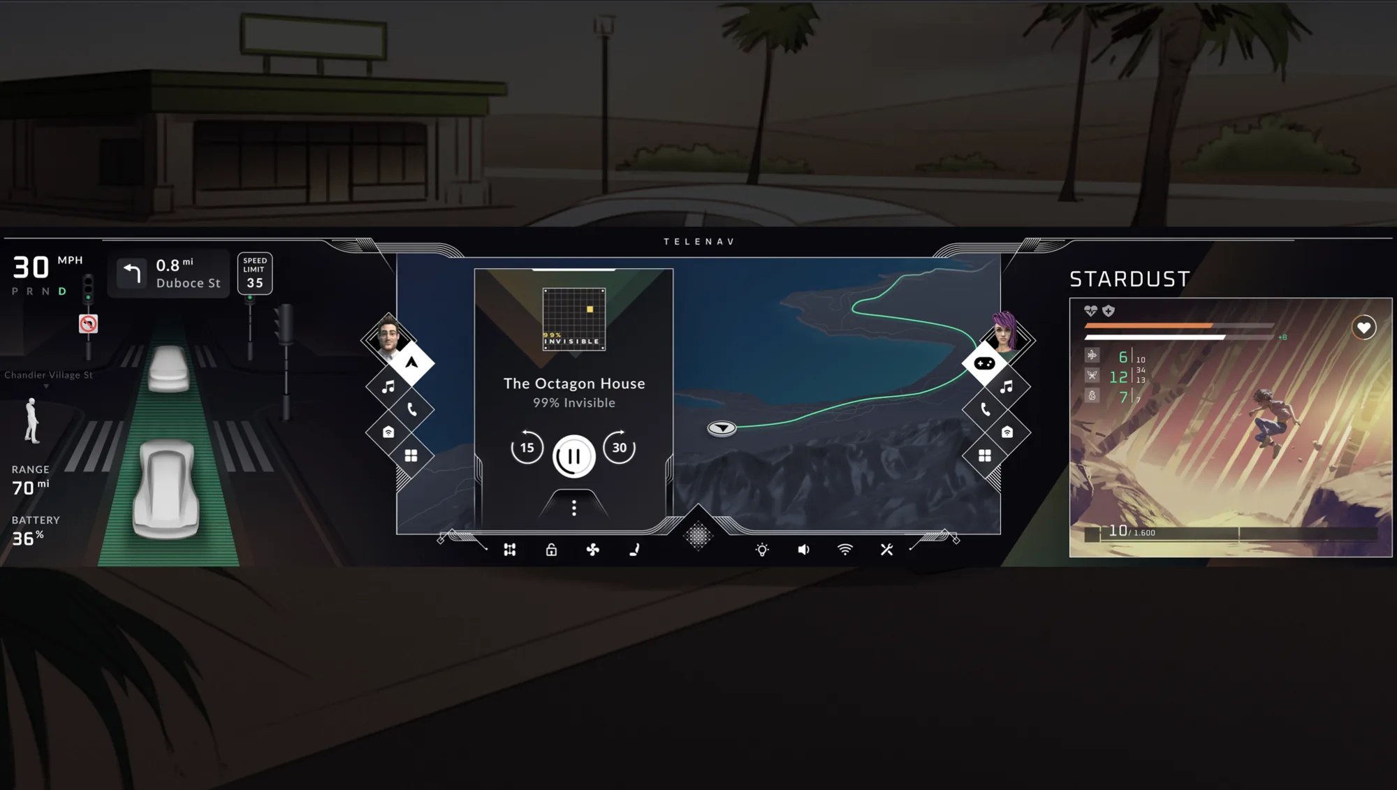
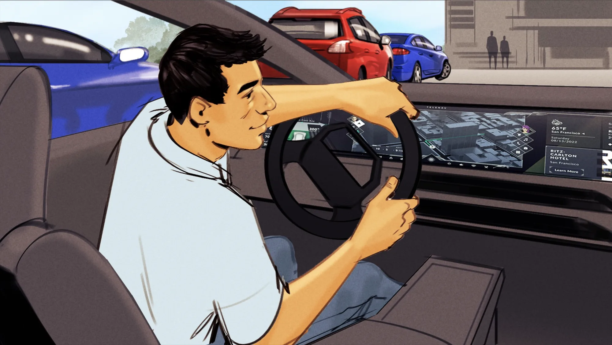
To pressure-test the architecture, I designed one continuous drive rather than disconnected screens, following a driver and passenger through a long EV trip to Hearst Castle and back. It exercises every state the system has to handle: welcome, park, reverse, manual drive, and self-driving.
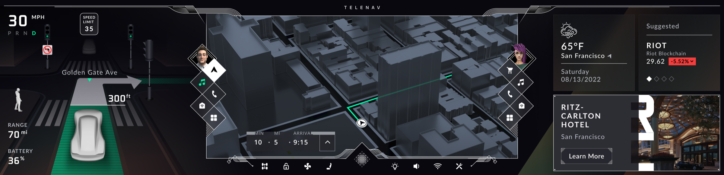
System first, screens second
The whole concept came together in about a month and a half: constraints first, structure second, screens last.
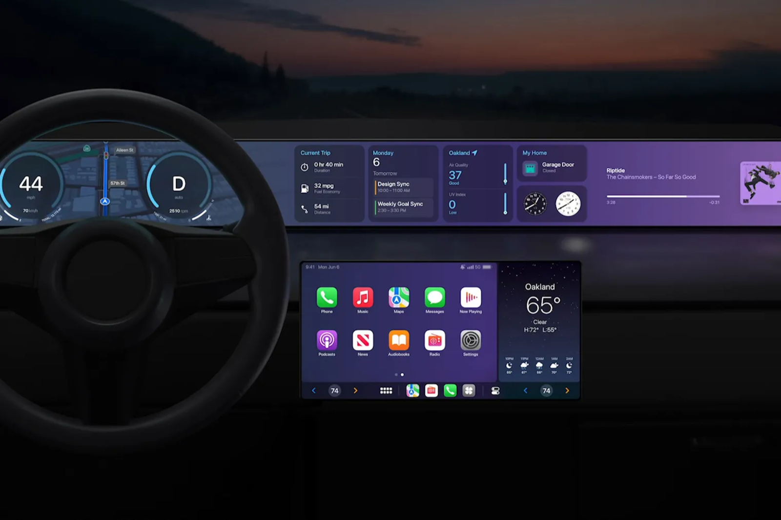
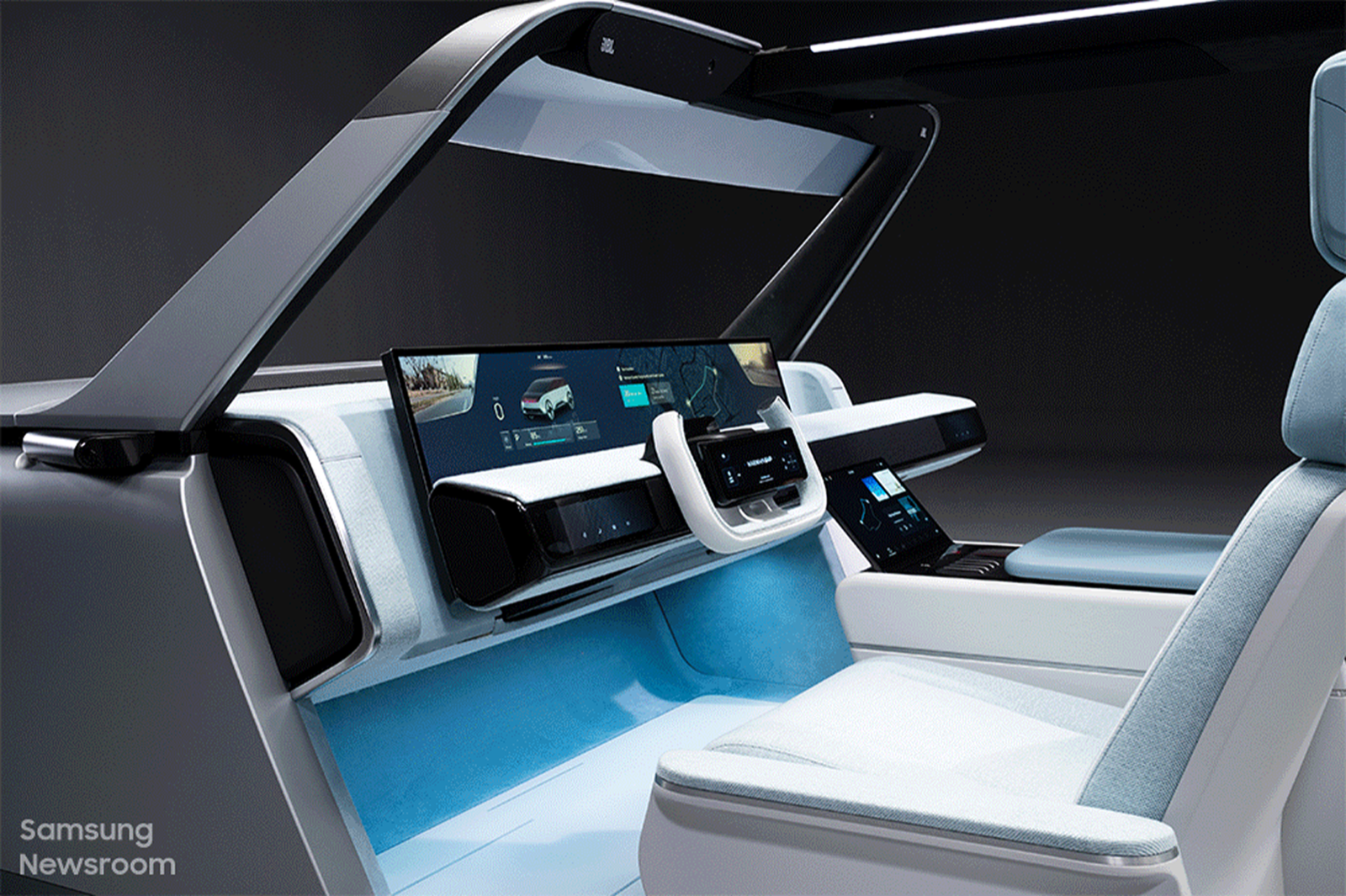
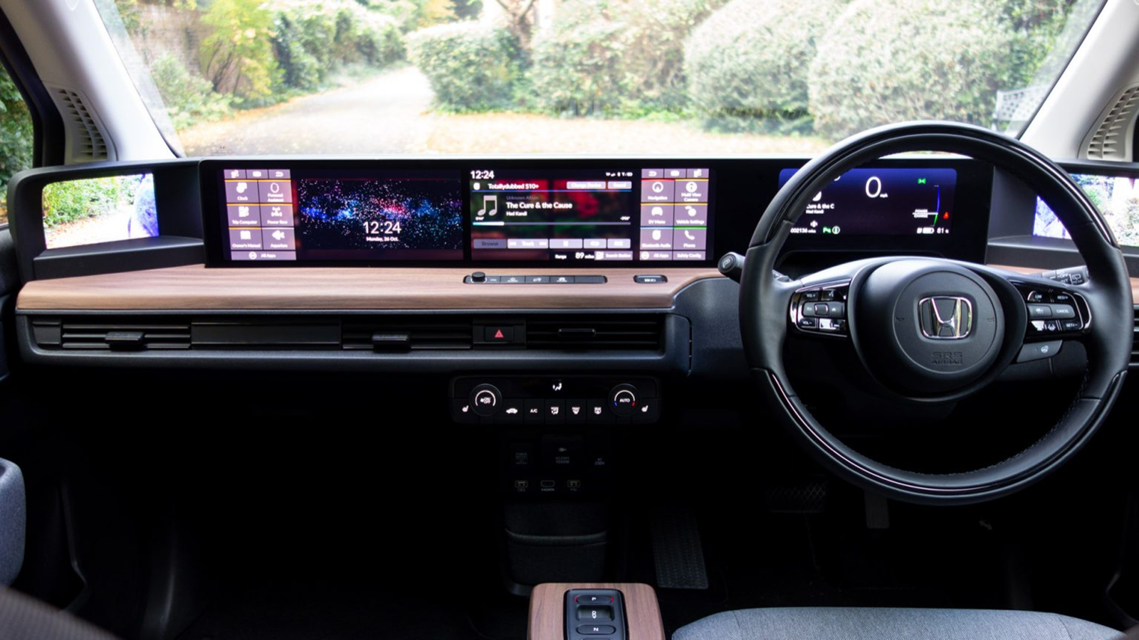
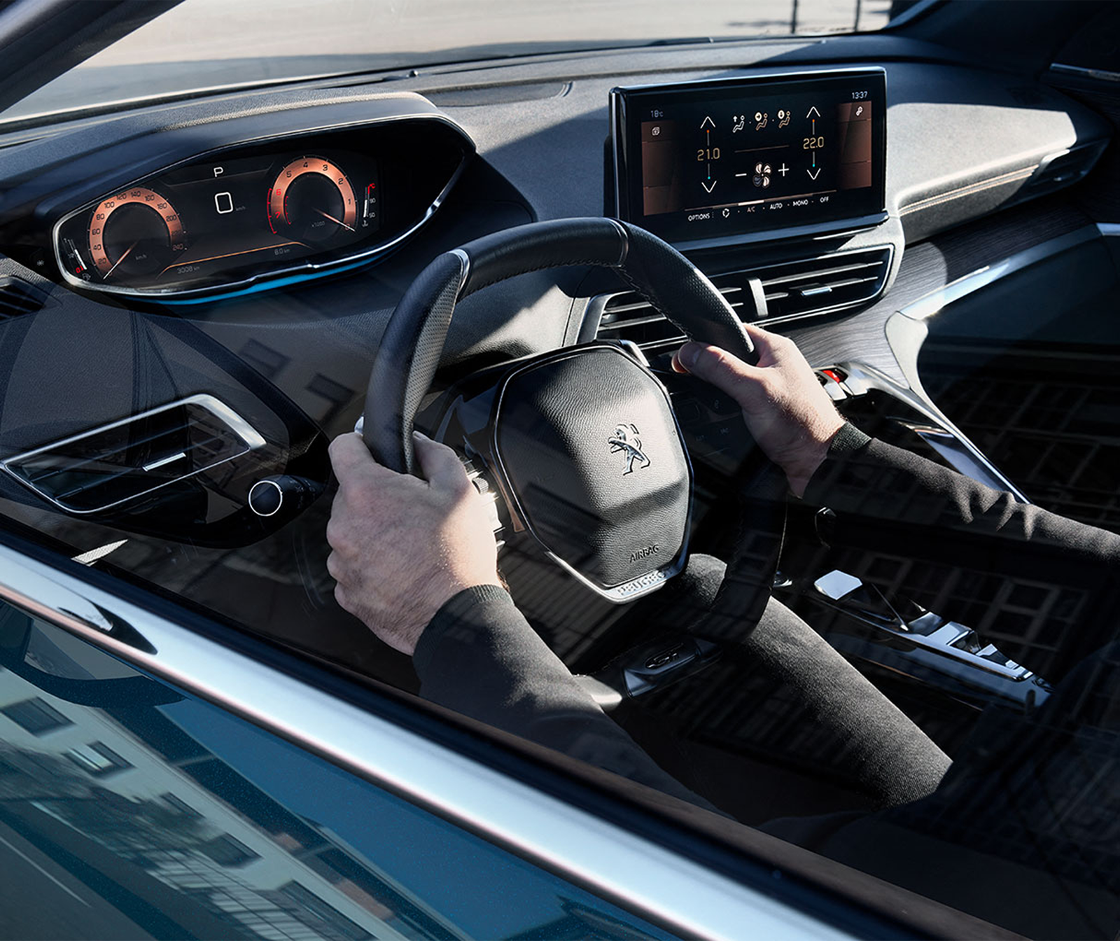
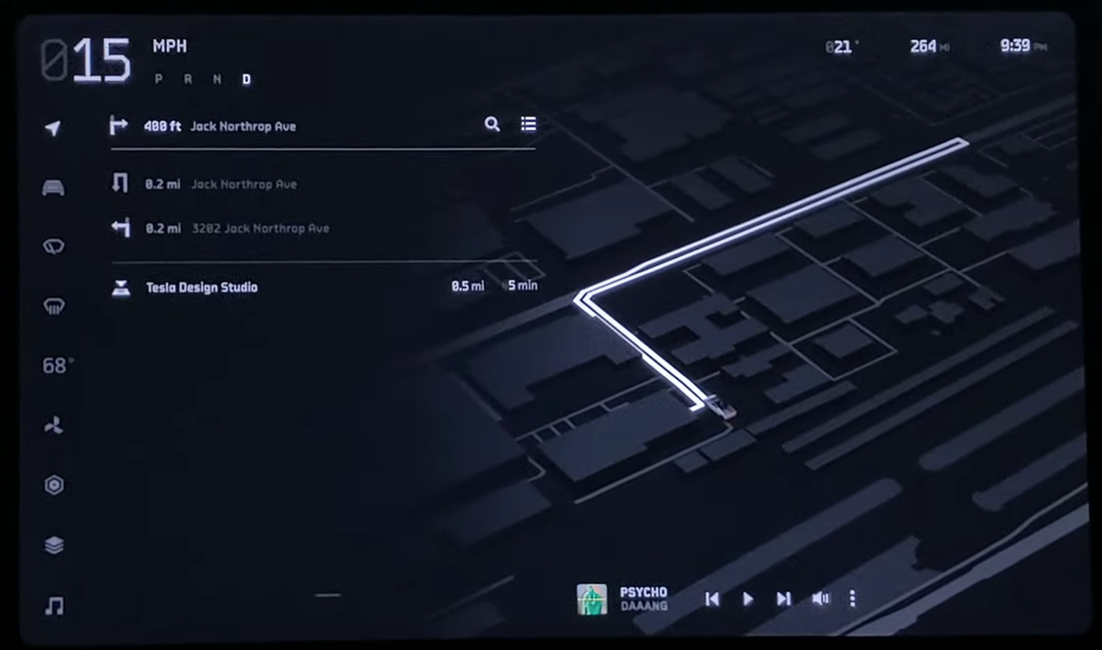
Part of the groundwork was studying where pillar-to-pillar cockpits and connected-car interfaces are heading, from shipping systems to concept cars:

Build the system before the screens
A driver reach study, then every function mapped to a region per vehicle state, then the zones, layering, and window sizes. The rules had to hold before a single screen was drawn.
Design the whole drive, low to high fidelity
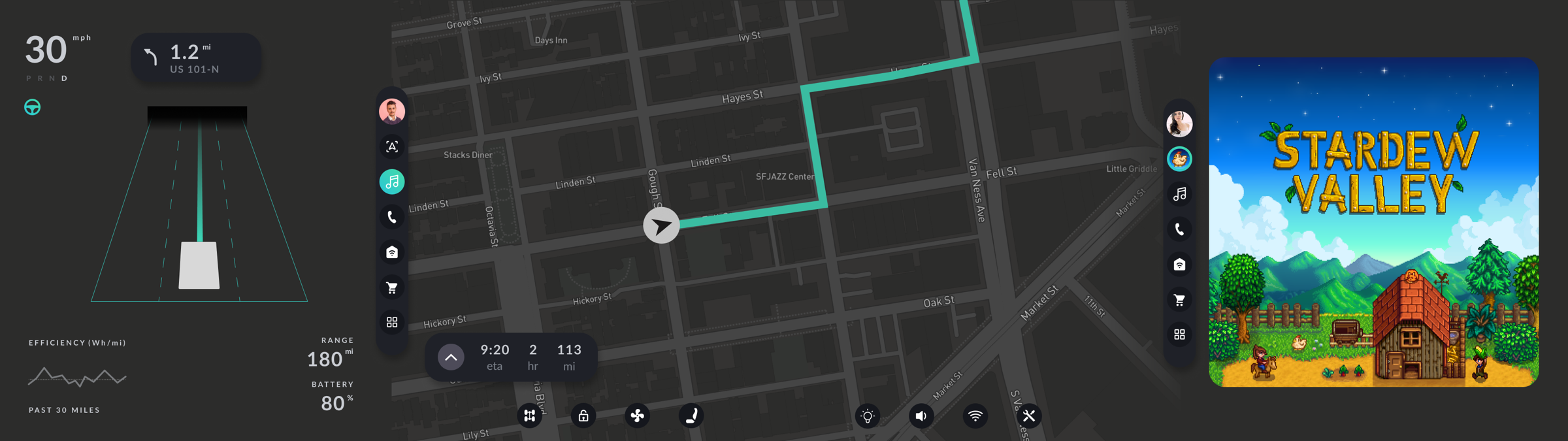
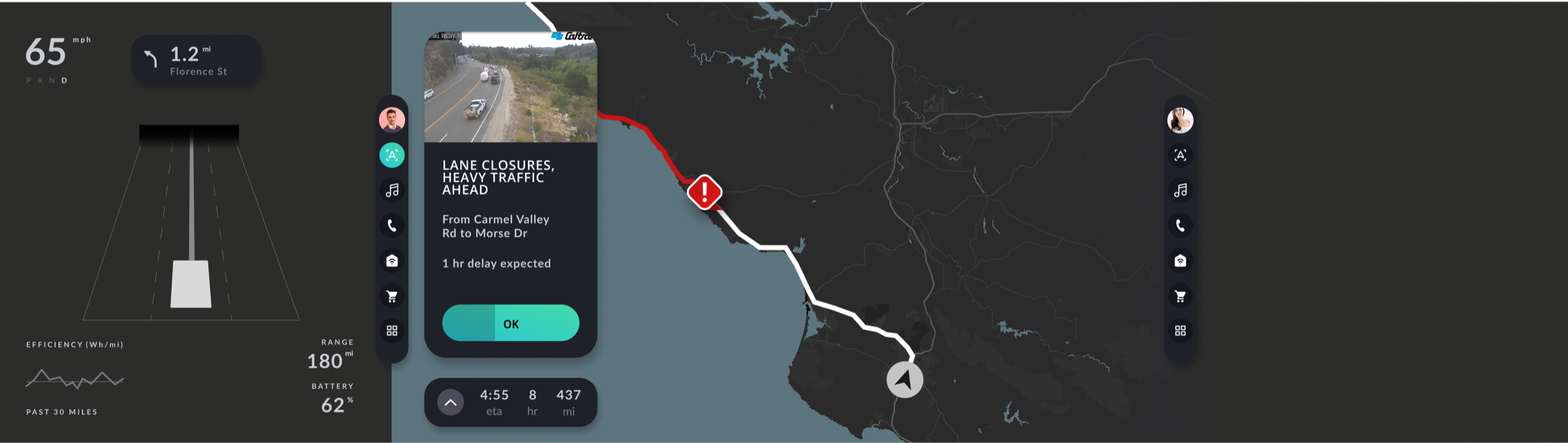
Then the screens, as one continuous drive: low fidelity to test placement and density across every state, high fidelity to make the future tangible for the pitch.
The low-fidelity exploration the high-fidelity screens were built from, one continuous drive, tested for placement and feel across every state:










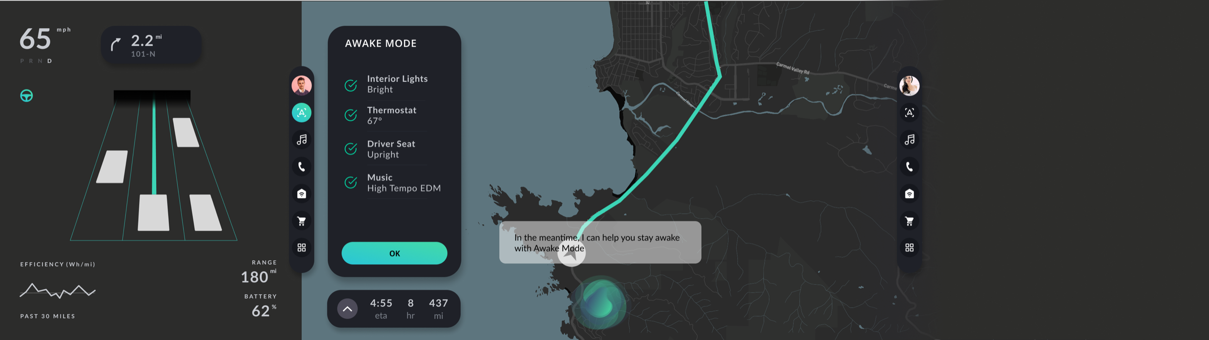
The final pitch
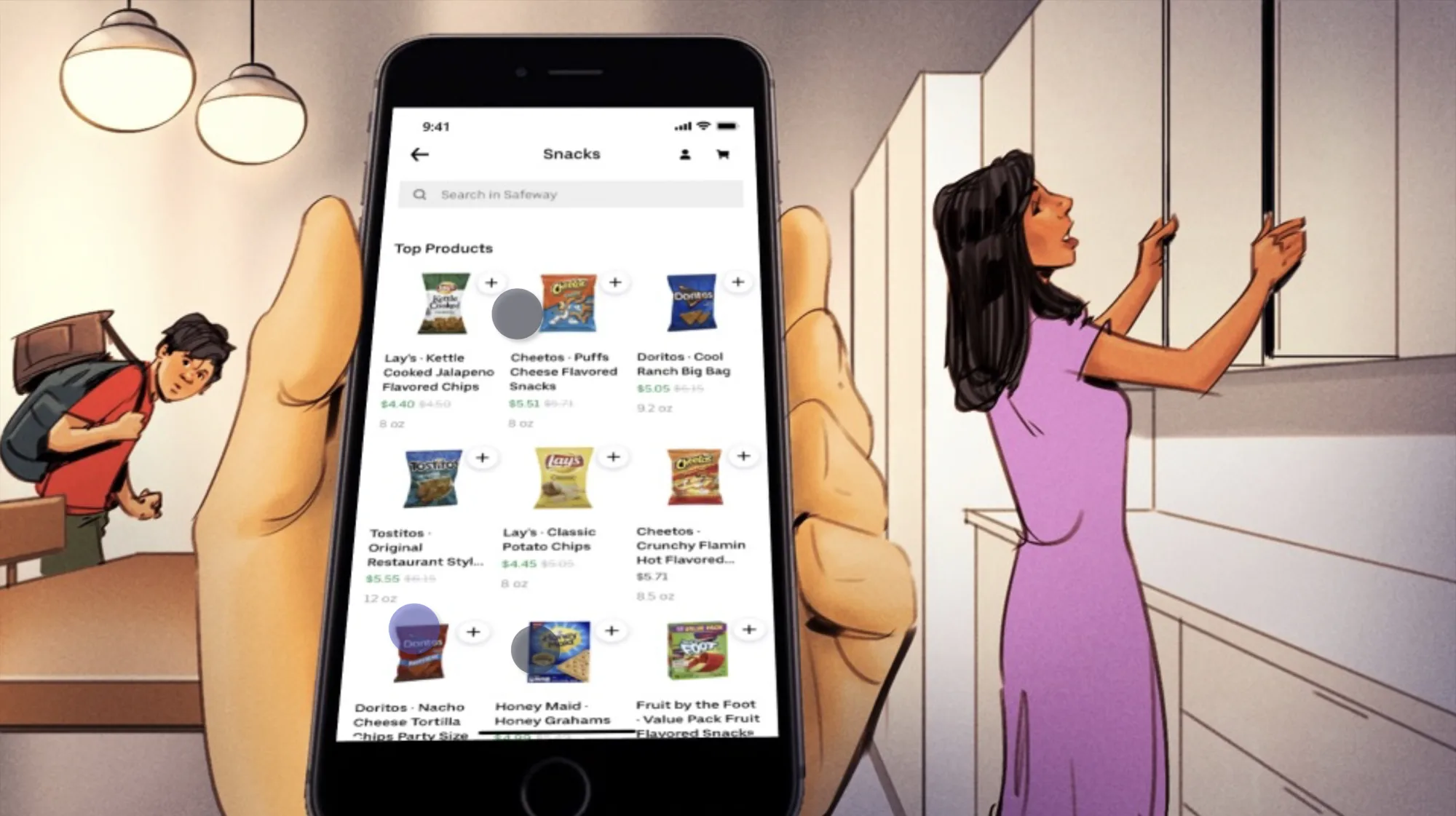
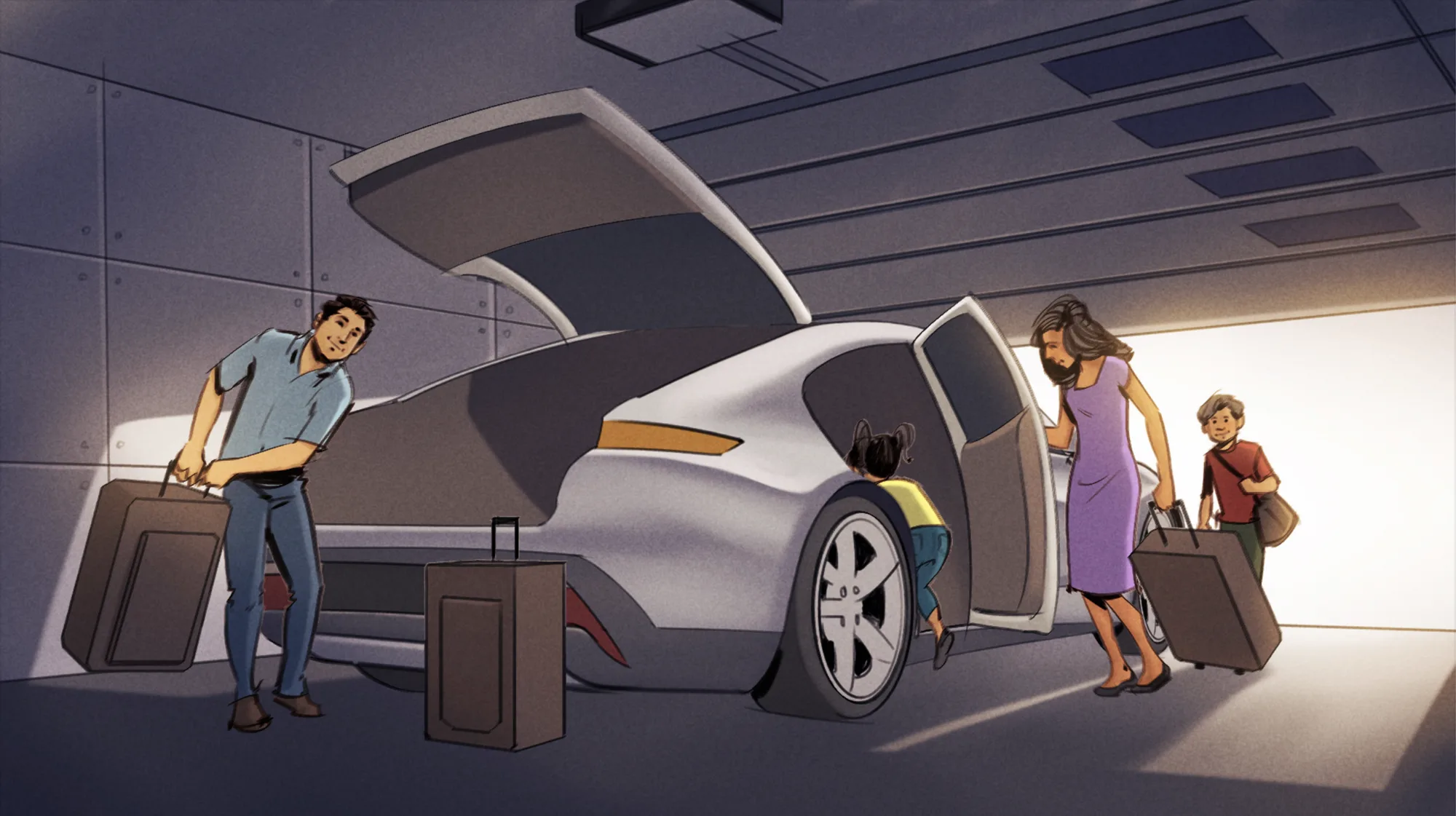
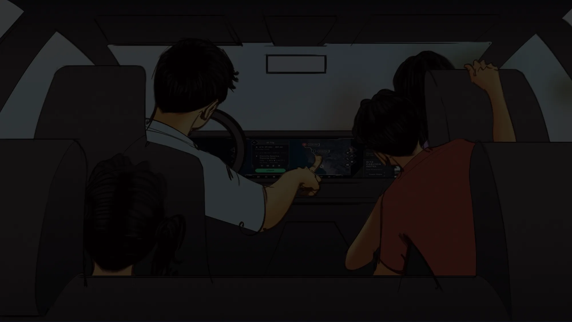
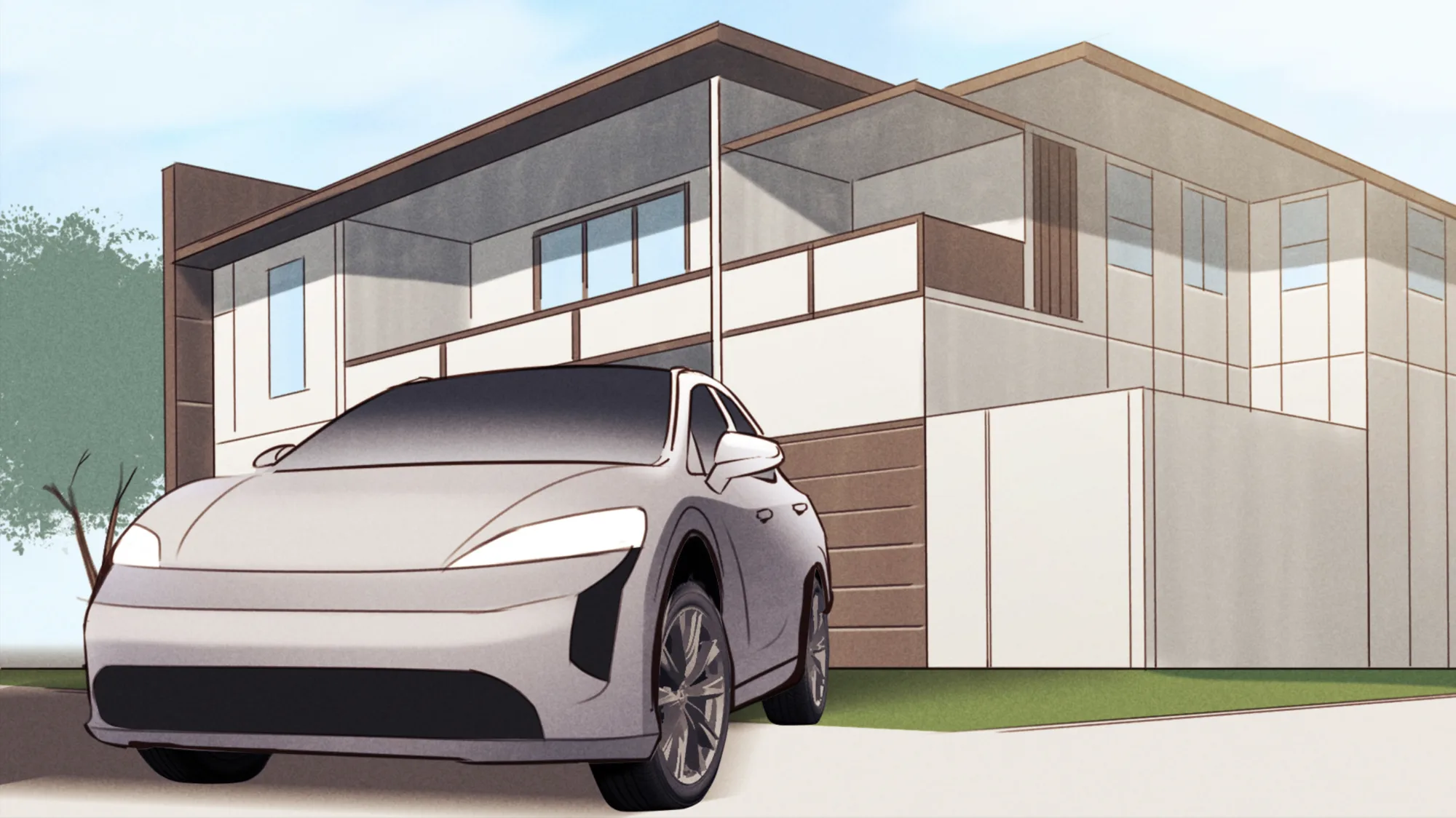
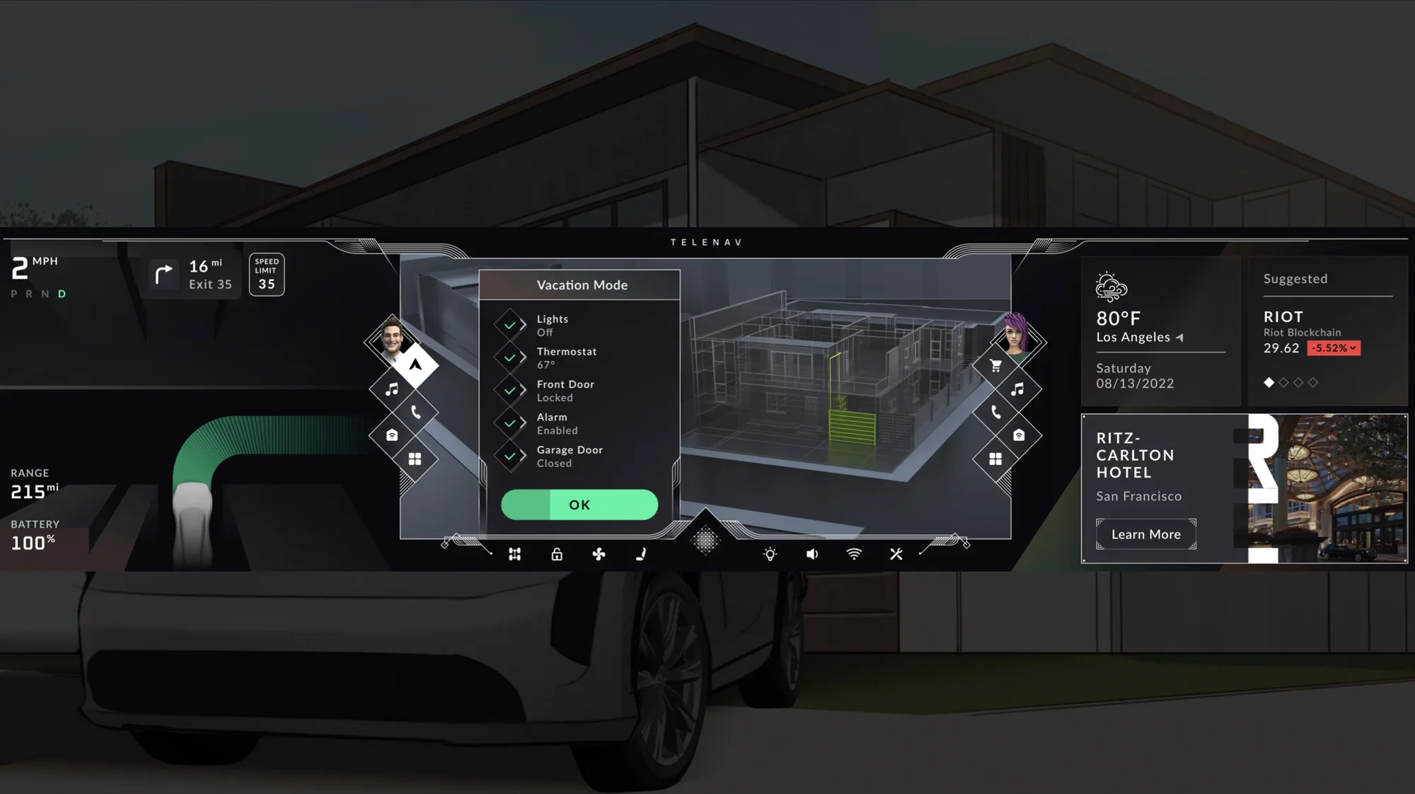
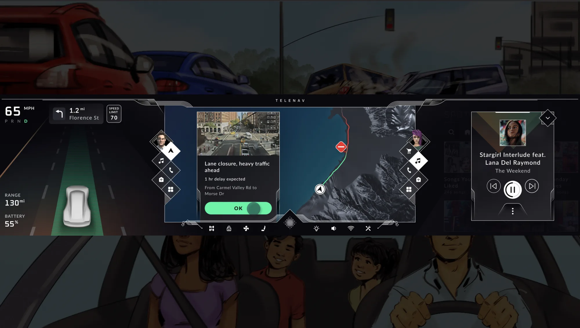
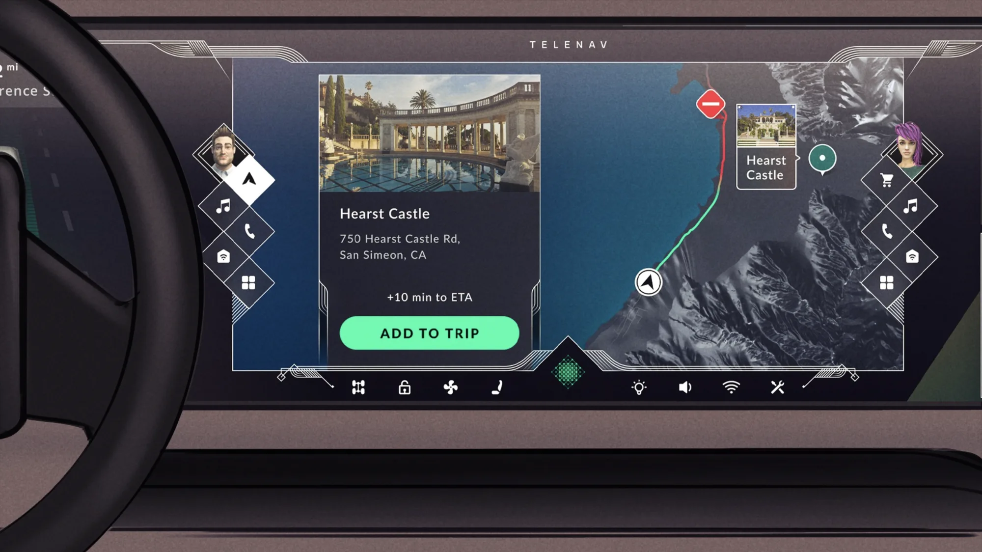
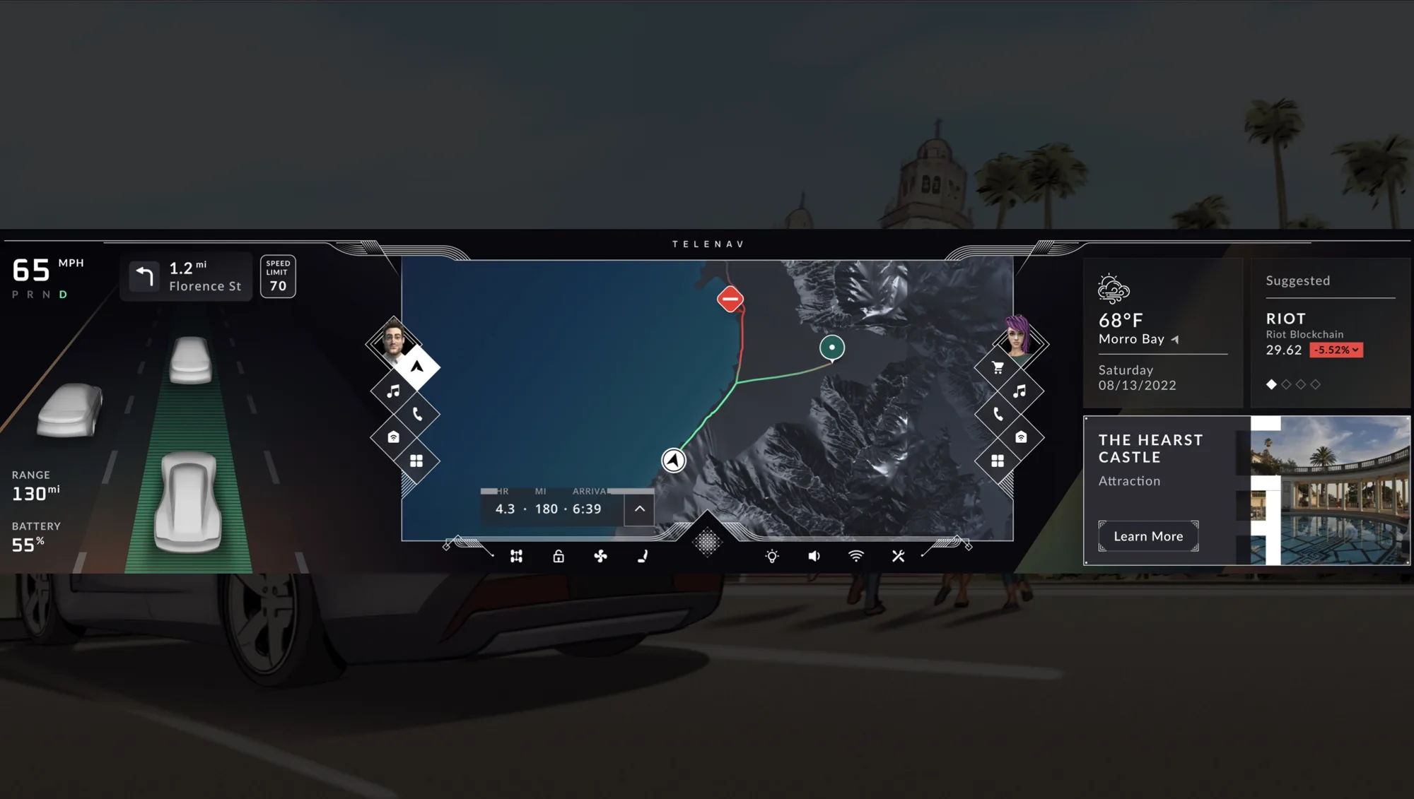
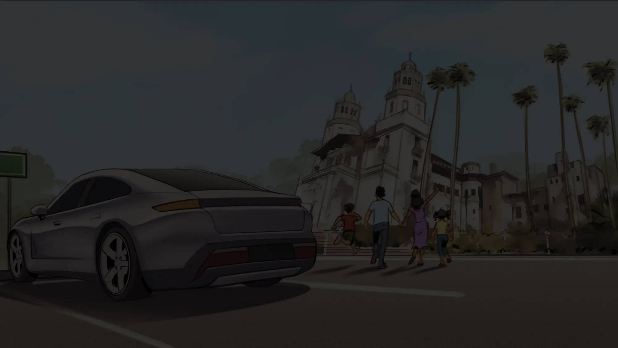
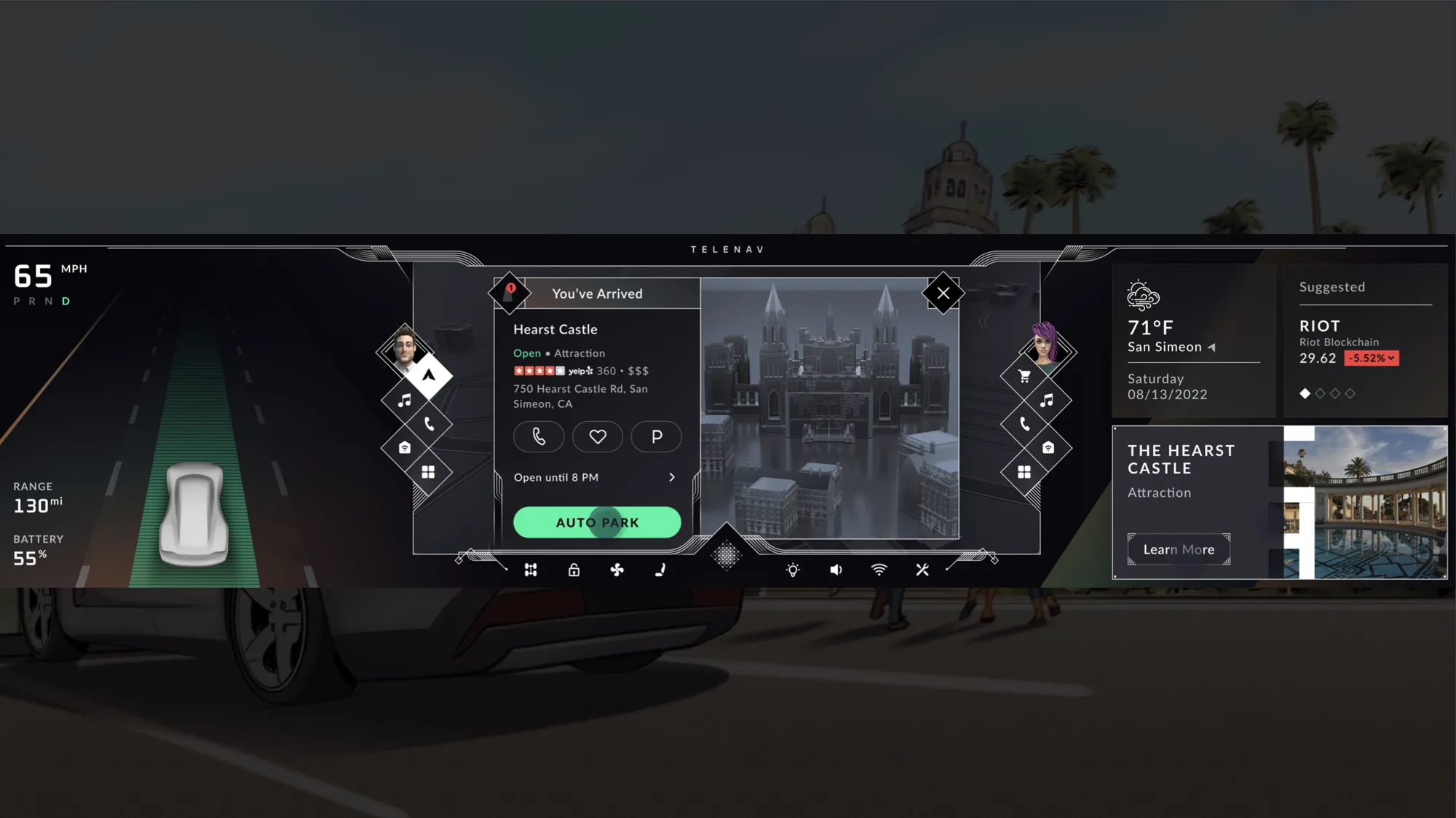
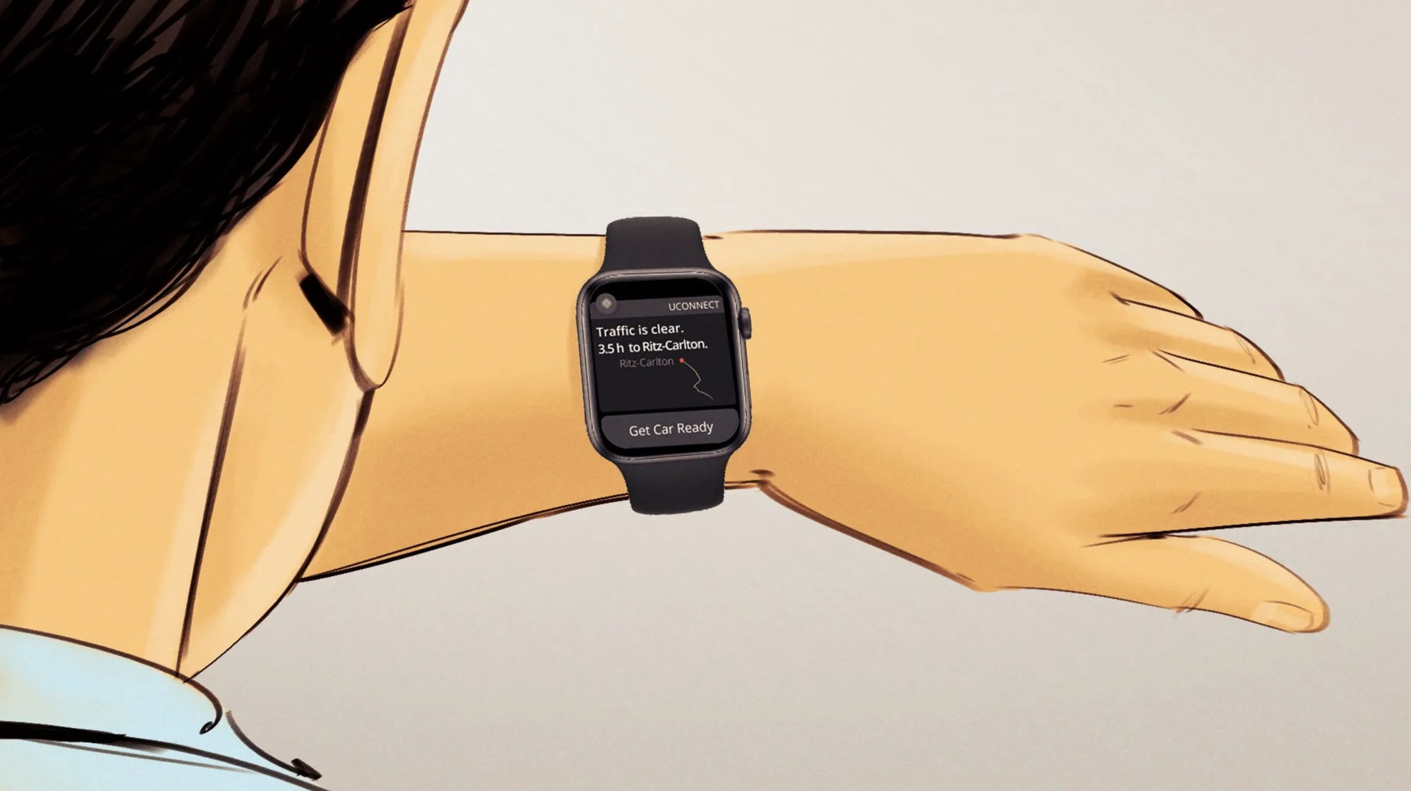
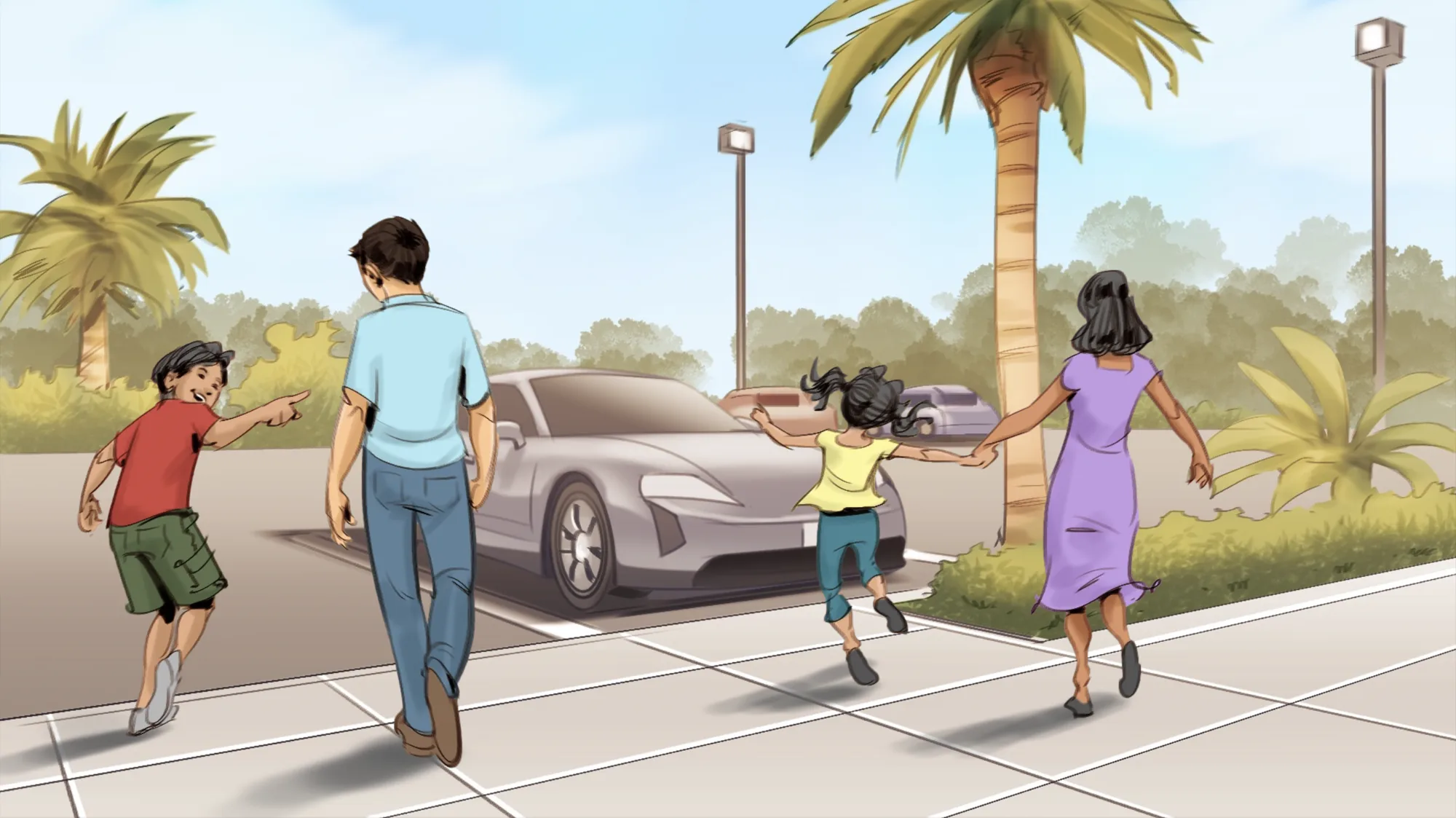
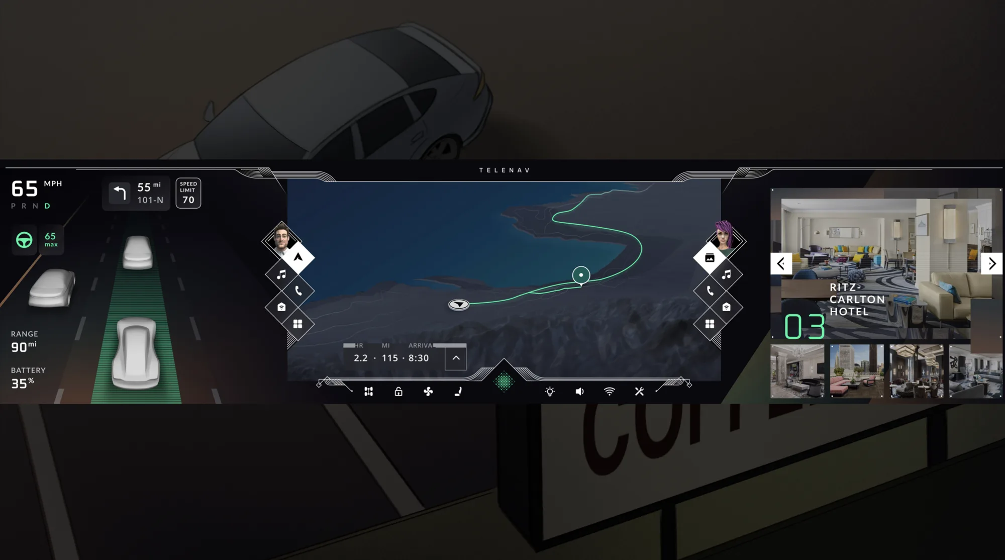
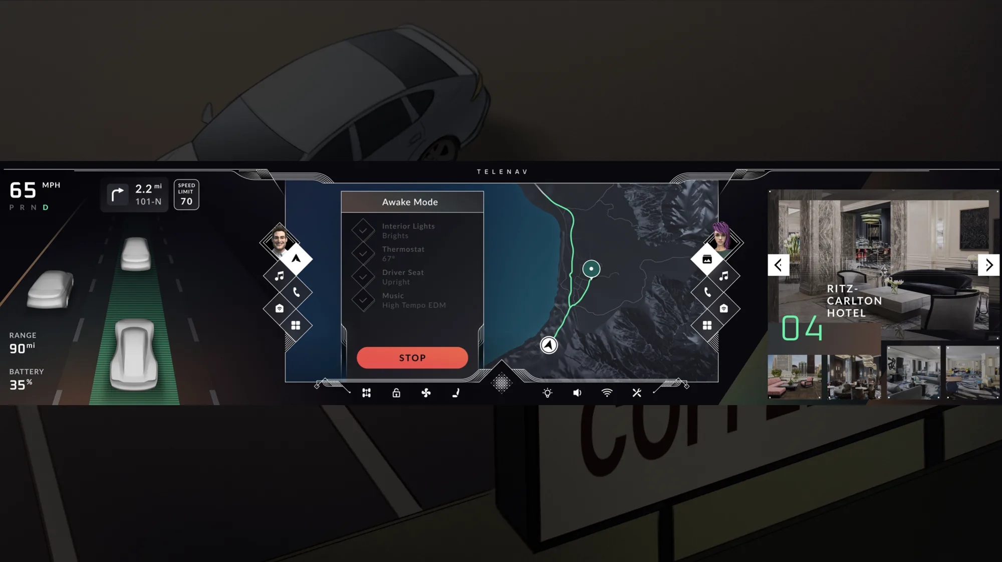
What I took away
The pitch did not win, but it's one of the most valuable projects I've led: my first time taking a big brief from a blank canvas to a complete, believable concept. What I kept from it is the order of work. Setting the rules for reach, zones and layering first is what let a screen this large stay calm once the screens were drawn.