Novo Quote
Rethinking the car insurance buying experience, reducing friction by asking one question at a time with conditional logic to skip what's irrelevant.
Rethinking the car insurance buying experience, reducing friction by asking one question at a time with conditional logic to skip what's irrelevant.
Novo Quote is Novo's auto insurance quoting flow: users answer questions, get a rate, and sign up for coverage.
The original design was long forms without pre-fills or smart logic to help user skip questions. Most users dropped without getting a quote.
Redesigned the flow question-by-question, added data pre-fill, removed the Submit button, and introduced conditional logic to skip irrelevant steps.
Overview
Novo Quote is Novo's primary customer acquisition product, the main way the company brings in new policyholders.
Users arrive from multiple channels: lead partners like Insurify and MediaAlpha, paid ads on Google and Meta, and organic traffic from the Novo website.
When I joined in late 2024, the flow was underperforming. Users were dropping off before finishing: the form felt long, some fields were confusing, and there were bugs to fix. There was clear room to improve.
The Problem
"84% of insurance leads abandon their quotes, the highest abandonment rate of any industry, exceeding even e-commerce. The leading causes: multi-page forms without progress indicators, too much information required upfront, and poor overall digital experience."
ProPair / Industry Research
The original experience put every question on one long scrolling page: a dense form asking users to process and fill out everything at once. Most didn't make it to the end.
There was also no data pre-fill. Even when Novo already had a user's information, from a lead partner or background check, they still had to type it in by hand. That friction alone drove significant abandonment. Worse, everyone saw every question regardless of their situation, with no way to skip ahead and no visibility into their progress or whether they'd even qualify.
Underneath sat real complexity. Insurance quoting carries strict regulatory and business rules about which questions get asked, and in what order. And depending on a user's answers, the flow branches: different follow-ups, eligibility outcomes, and product options that compound fast. The core problem was handling all of that while still feeling simple and linear.
My Process
A question-by-question redesign meant rebuilding the entire funnel from scratch, which was no small ask. Before that could happen, I needed evidence to make the case.
I ran competitive analysis on how other insurance and fintech products handle multi-step flows, and pulled Novo's analytics to map where users dropped. The most convincing evidence came from session replays: watching real users made the problem impossible to ignore. They weren't just leaving because the flow was long; they were also retyping information Novo already had.
With that evidence I made the case to the PM and stakeholders, grounded in session data, drop-off rates, and competitive precedent. I also cleared the smaller usability debt: unclear labels, broken interactions, confusing copy. Those fixes mattered as much to the final completion rate as the redesign.
Rather than rebuild all at once, we phased the rollout over three months, validating early and learning as we went. Here's how it broke down.
Competitive analysis, product analytics, session replay review, and getting stakeholder buy-in on the question-by-question direction and pre-fill strategy.
Designing the conditional branching logic, defining which questions could be skipped, and establishing the entry experience for different traffic sources.
Rolling out the redesigned flow in stages across the funnel over three months, iterating based on performance data along the way.
Refining copy, improving rate estimate placement, flagging ineligible users earlier, and polishing the overall experience.
Proposed Solution
A long scrolling form asks users to take in everything at once. A question-by-question flow asks for one thing, then moves on. The cognitive difference is significant, and it shows in completion rates.
We also removed the "Next" button entirely. Tapping an answer advances the flow; a "Back" button is always available. That one change cut required taps roughly in half, and it makes every tap feel like progress: the bar advances and the screen transitions with each answer, instead of users weighing whether to continue.
"Simplifying registration forms consistently produces hugely increased conversion rates. Removing friction from any step of a form reliably improves completion, and form usability improvements are one of the strongest ROI arguments for UX investment."
Nielsen Norman Group
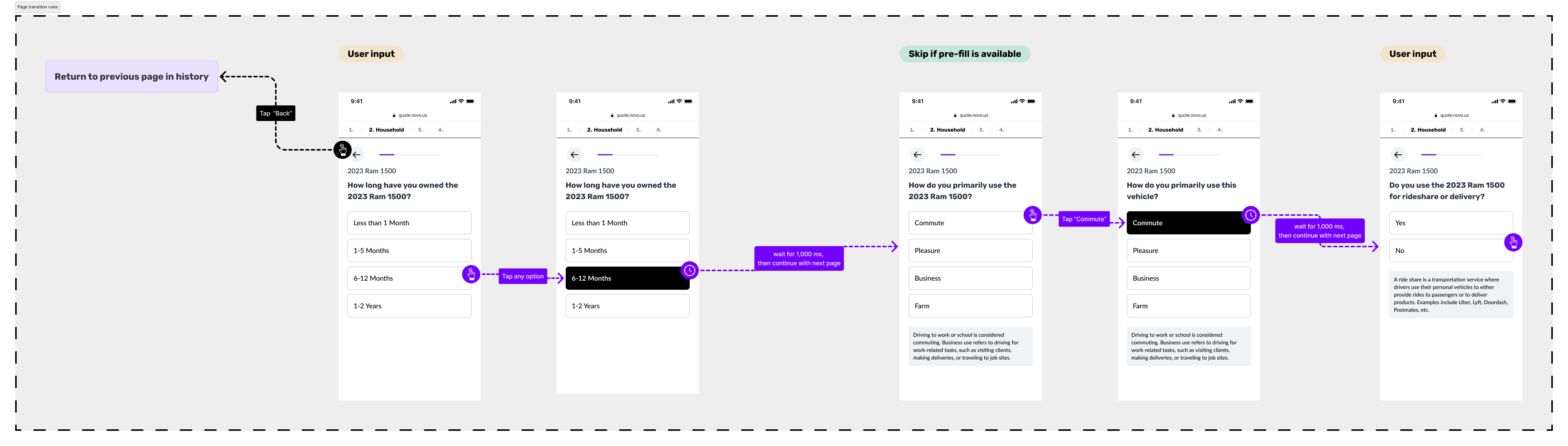
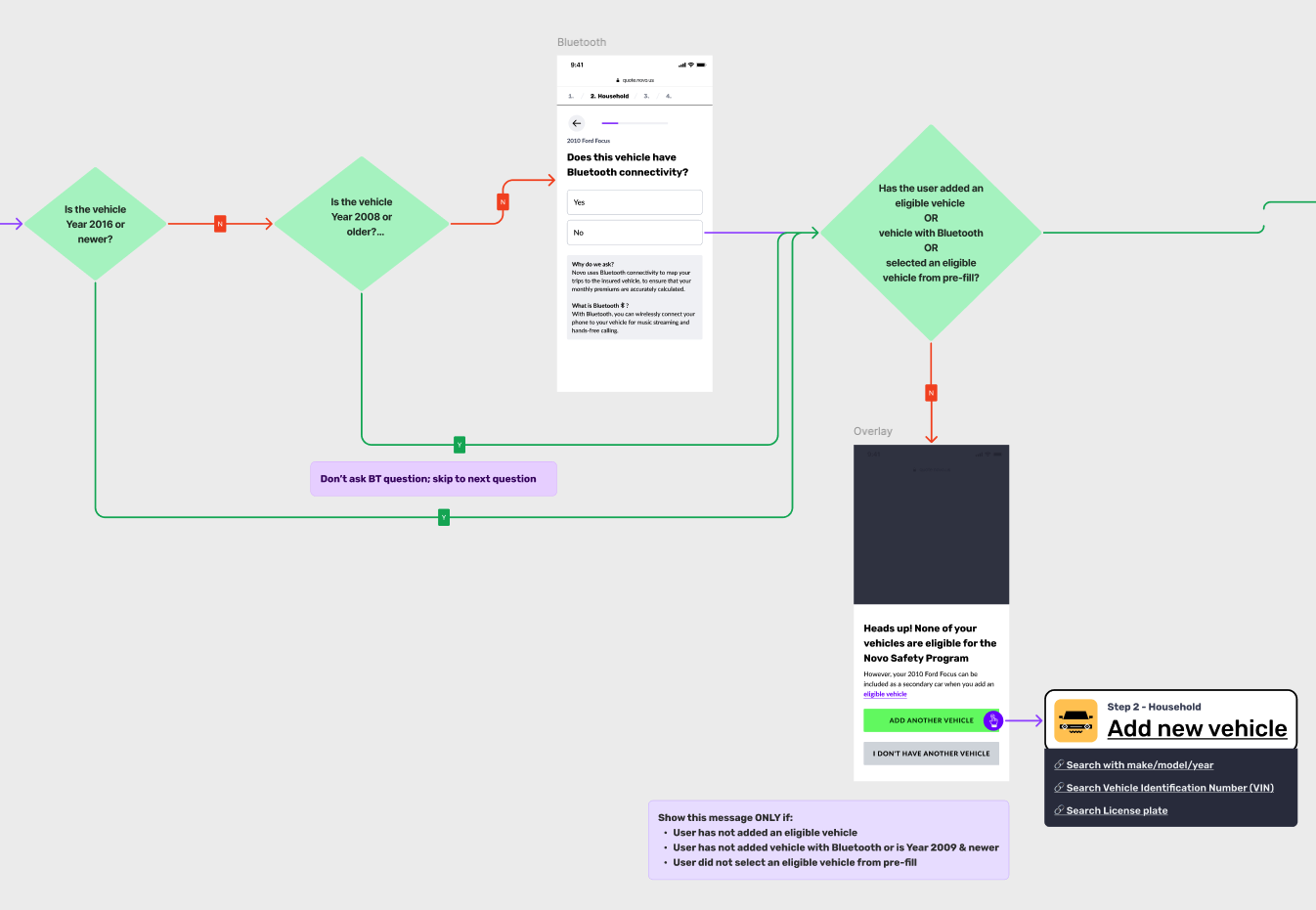
Answers trigger conditional branching behind the scenes. If a question isn't relevant, users skip it without knowing. If more detail is needed, a follow-up appears. The flow adapts to each user's situation while still feeling linear and simple.
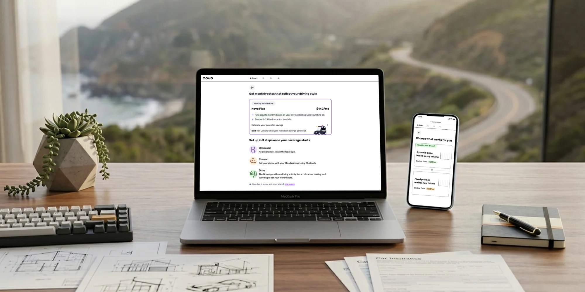
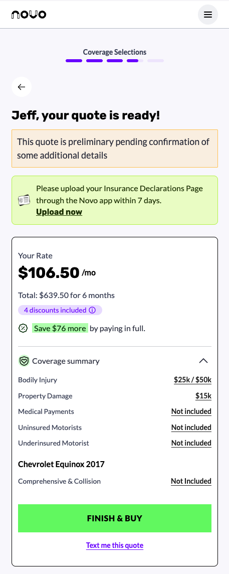
We surfaced the rate estimate earlier, so users aren't waiting until the final screen to see a number. Rather than updating it in real time (which risks showing the price climb with every driver or vehicle added), we show it at specific moments.
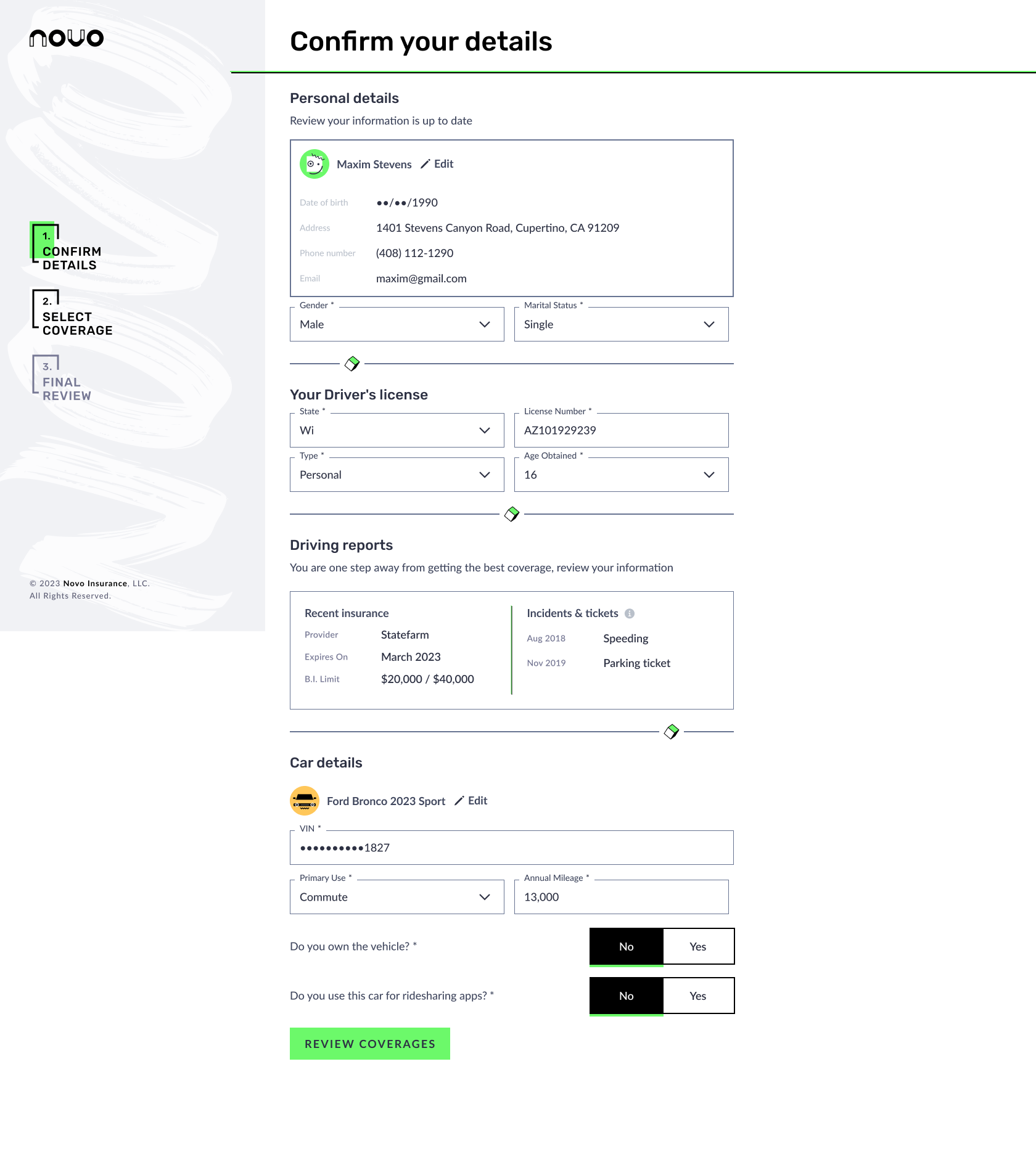
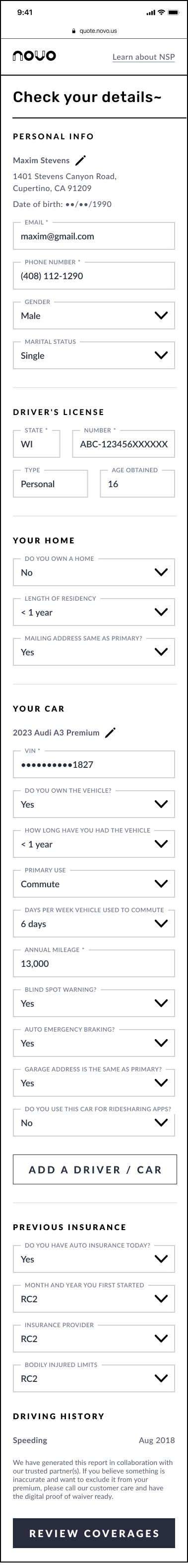
Session replays made it clear that asking users to retype data Novo already had was one of the biggest drivers of abandonment. A background check at entry, plus information from lead partners, lets us prepopulate fields and surface them for confirmation rather than re-entry, and skip questions a user doesn't need to answer at all.
Most users aren't familiar with telematics-based insurance. Rather than explain it all at once, we break the concept across a sequence of screens, using visuals and plain language to build understanding right when it's relevant.
Previously, some users completed the entire flow only to learn at the end they didn't qualify. We now flag them earlier, saving their time and improving the quality of applications that make it through.
The Flow
Eight steps from first landing to active policyholder. Each one designed to ask only what's necessary, pre-fill what we already know, and keep the user moving.
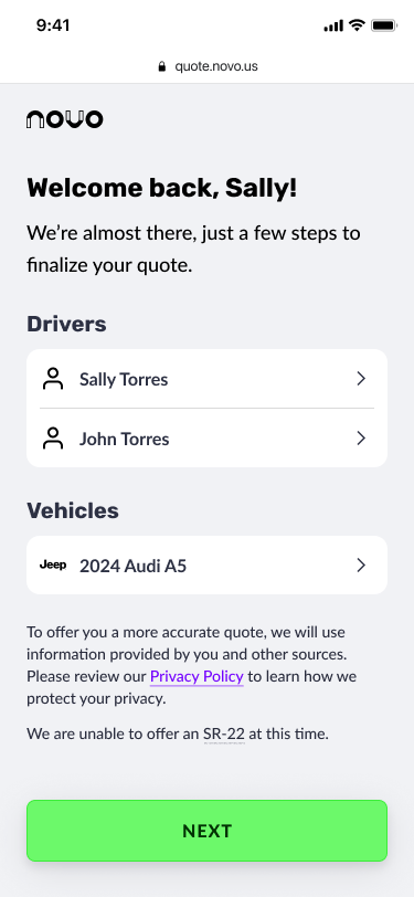
The user lands and sees what we already know about them, or a clean slate if they're coming in cold. A background check runs in the background to assess risk and prepopulate data where possible.
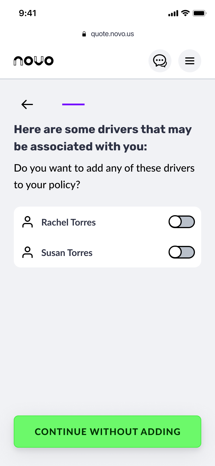
All household members and potential drivers are added to the policy. Known information surfaces for confirmation rather than re-entry.
Vehicles to be covered are added. Each addition adjusts the rate estimate at the right moment.
Driving history is collected or pulled from the background check. Occupation, prior coverage, and lapse of insurance round out the risk profile.
Users choose from three product variants. The Novo Safety Program is introduced here: a telematics approach that uses Bluetooth to track driving behaviour and adjust pricing over time.
The user reviews their quote in full. Changes can still be made. Last checkpoint before commitment.
Electronic signature, email verification, payment. The user is now a Novo policyholder.
Users download the Novo app and complete vehicle setup to activate the telematics safety program.
Results
Every key metric improved from Q1 to Q2 2025.
The table compares Jan–Mar against Apr–Jun.
| Jan – Mar 25 | Apr – Jun 25 | ||
|---|---|---|---|
| Quote Completion % | 16% | 50% | 3× |
| Quote to Bind % | 4.5% | 9% | 2× |
| Visitor to Bind % | 0.3% | 2.8% | 10× |
| # of Binds | 31 | 958 | 30× |
Beyond the headline numbers: time to quote dropped to around five minutes on average, with one user finishing in under forty seconds. New customers also showed stronger risk profiles, a direct result of the smarter flow collecting better-quality data.
Novo Quote is live and growing. Over 2,500 paying customers since launch, and counting. These are monthly subscribers, not free sign-ups.
A note on growth pace. Shortly after launch, the team noticed churn: customers signing up but not sticking around. In response, Novo pulled back on ad spend and tightened acquisition criteria, trading volume for quality. The 2,500 figure reflects that choice: a smaller number than aggressive growth would have produced, but customers worth keeping.
Reflection

The question-by-question pattern was the biggest lever, but not an obvious call. It took research to back it up, data to make the case, and stakeholder trust to execute. Phasing the release was the right move: it proved the concept on a slice of the flow before committing to a full rebuild.
Some of the biggest wins came from small, deliberate decisions: dropping the Submit button to save a tap on every question, or holding the rate back from real-time updates, since a price that keeps climbing as you add drivers is accurate but stressful to watch. Each sounds small on its own; together they made the flow feel thought-through, not mechanical.
What I didn't see coming was the churn. After a strong launch quarter, a meaningful number of customers dropped off within months. Optimising hard for conversion had a side effect: we were letting through users who weren't the right fit. The team tightened acquisition criteria and pulled back on ad spend, trading volume for quality. It was the right call, and it sharpened my thinking about what good conversion design means: not just getting people through the funnel, but the right people.