Defining the driver experience
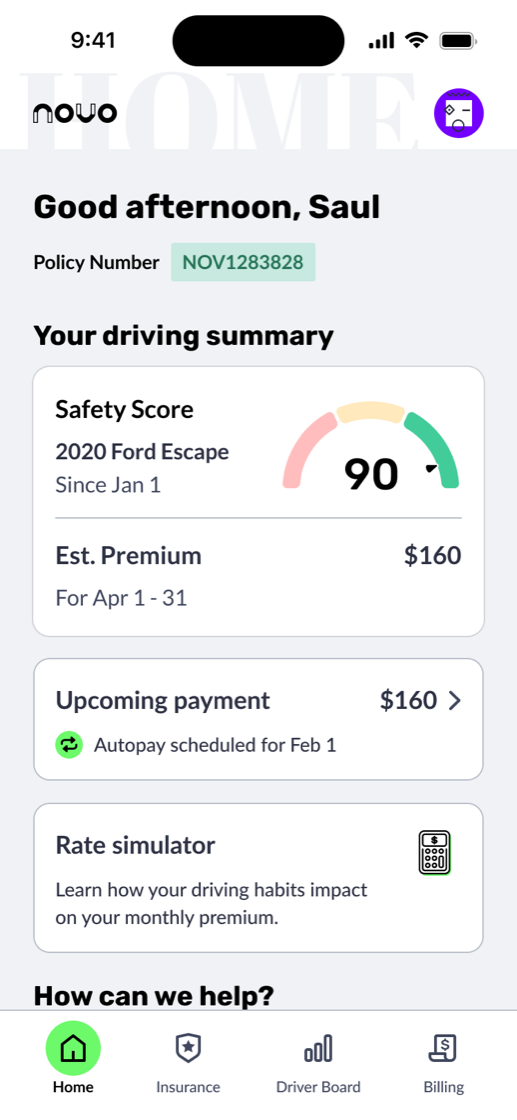
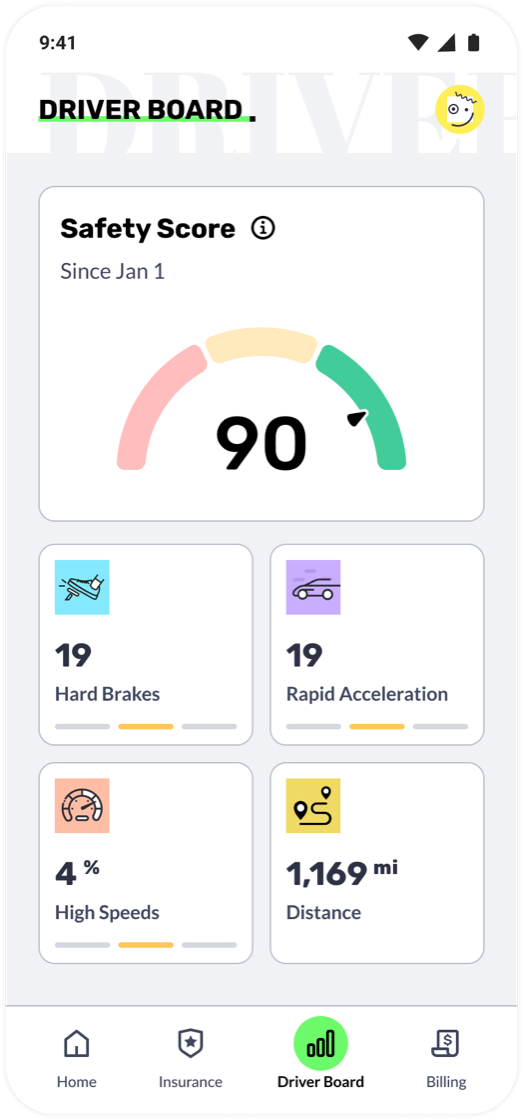
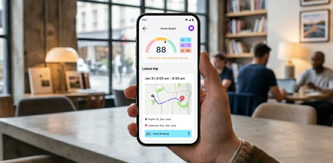
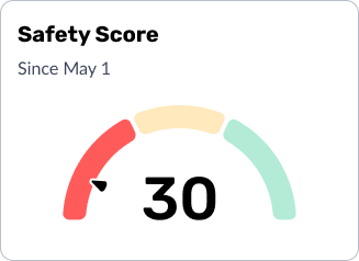
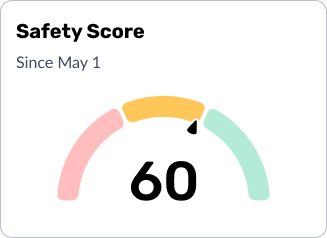
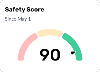
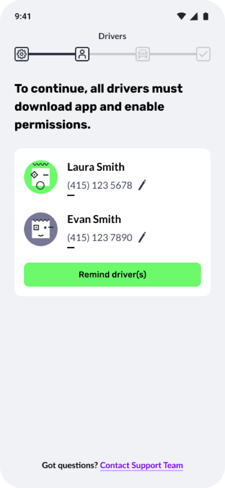
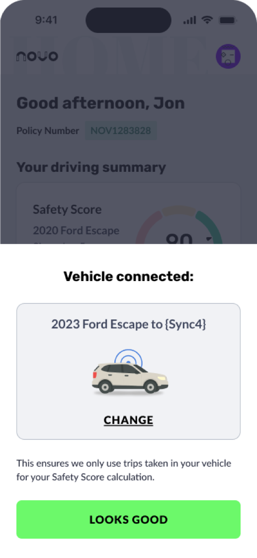
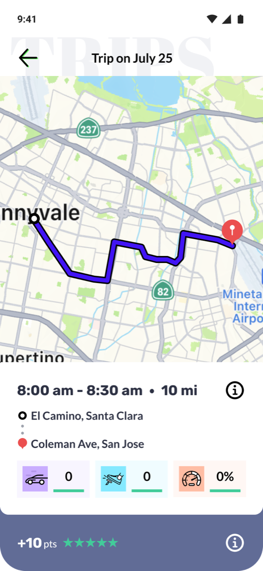
The Novo Driver App is the policyholder's core experience. It connects to telematics data to track real driving behavior, such as hard braking, rapid acceleration, and speeding events. Those inputs feed a live Safety Score, which in turn influences the insurance premium.
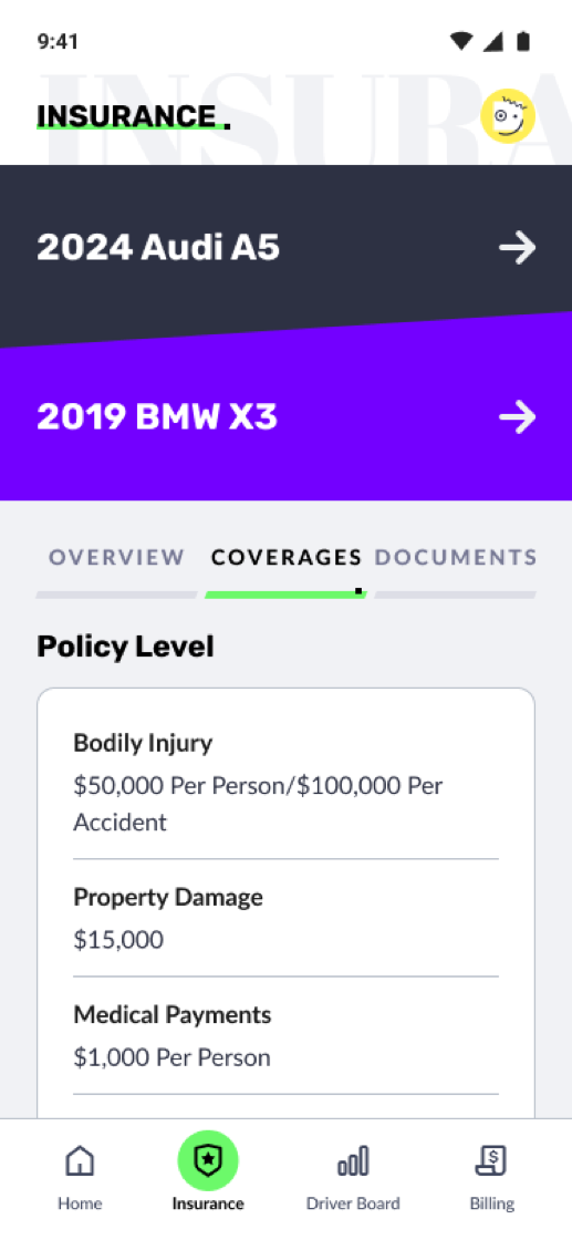
Beyond that, the app handles onboarding, document upload, viewing insurance documents, claims filing, and personalized engagement features tied to your telematics data. I own the end-to-end design for the entire app.
Enabling self-service everywhere
A core design principle running through the Novo App is self-service first. Rather than relying on customer service reps to shepherd users through each step, which introduces delay, dropout, and friction, I designed in-app flows that let customers complete critical tasks themselves, on their own time.
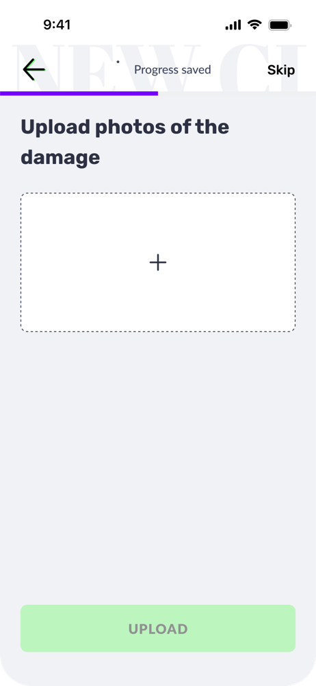
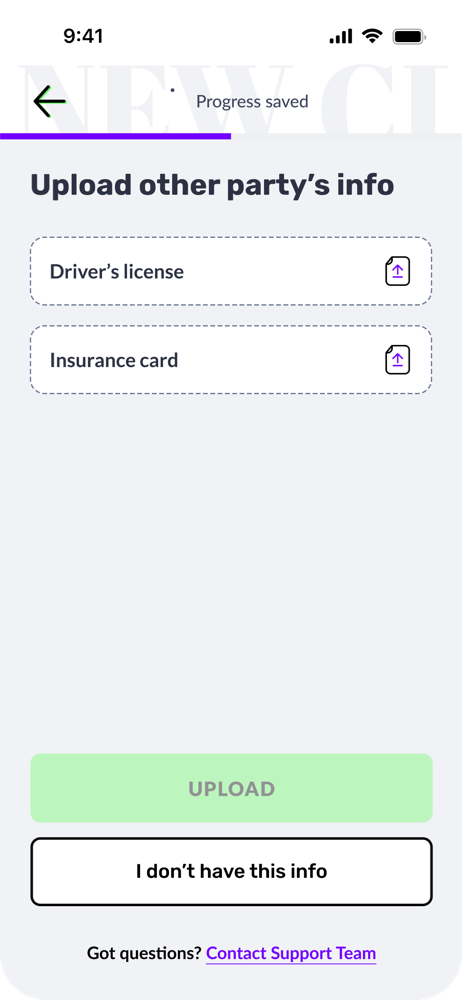
Document & Photo Upload
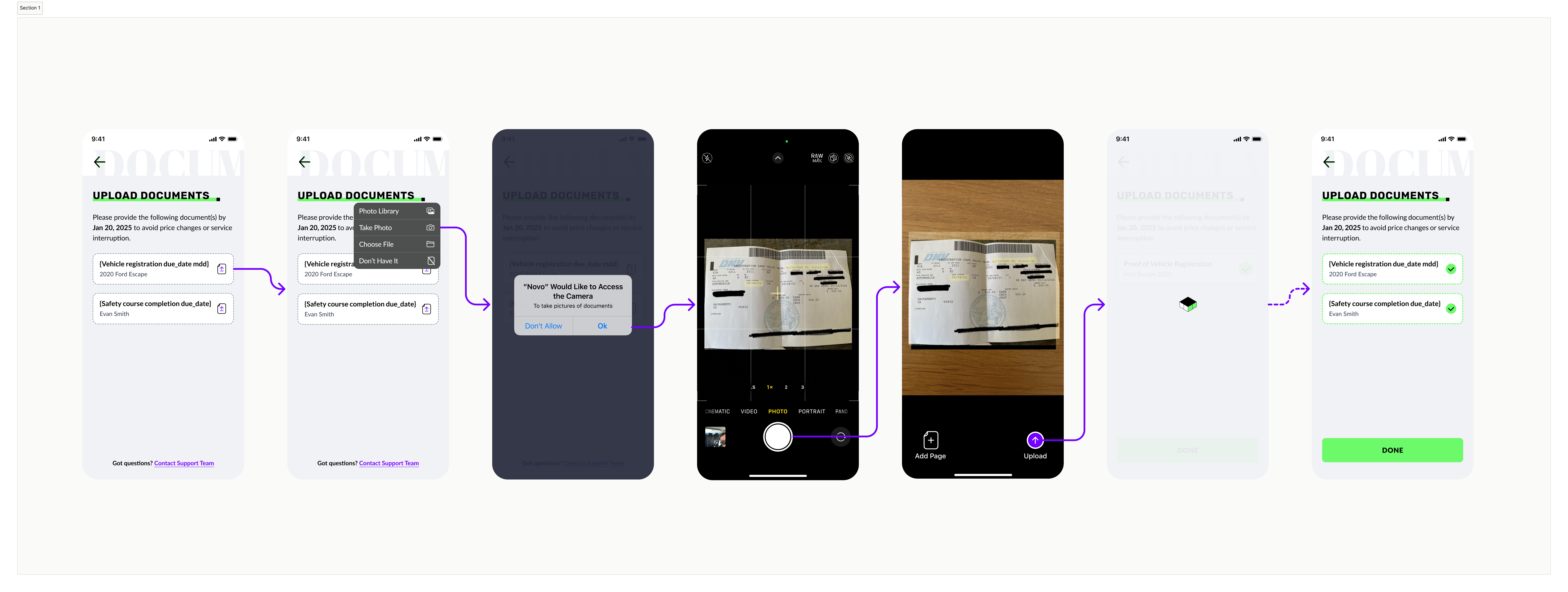
When customers first sign up for Novo, they need to provide supporting documents. This includes vehicle photos, proof of prior insurance, driver license, etc.
Previously, a customer service rep reached out by email or phone to collect them. The result was predictable: completion hovered in the low forties. The outreach was asynchronous, customers had mentally moved on, and there was no single clear action to take.
By building document upload directly into the onboarding flow, surfaced immediately after the app download, we shifted the timing to when attention is highest. The task appears while signup is still top of mind, motivation is still present, and the path forward is clear.
- CSR contacts customer post-signup by phone or email
- Customer manually sends documents on their own
- No in-app prompt or guidance
- Momentum lost between signup and outreach
- Upload step presented immediately after app download
- In-app guided flow with clear instructions
- Task completed while intent is highest
- No dependency on CSR scheduling
Timing is a design decision. Showing the right task at the right moment, when motivation is at its peak, is often more impactful than the task itself.
Multi-Driver Policy Setup
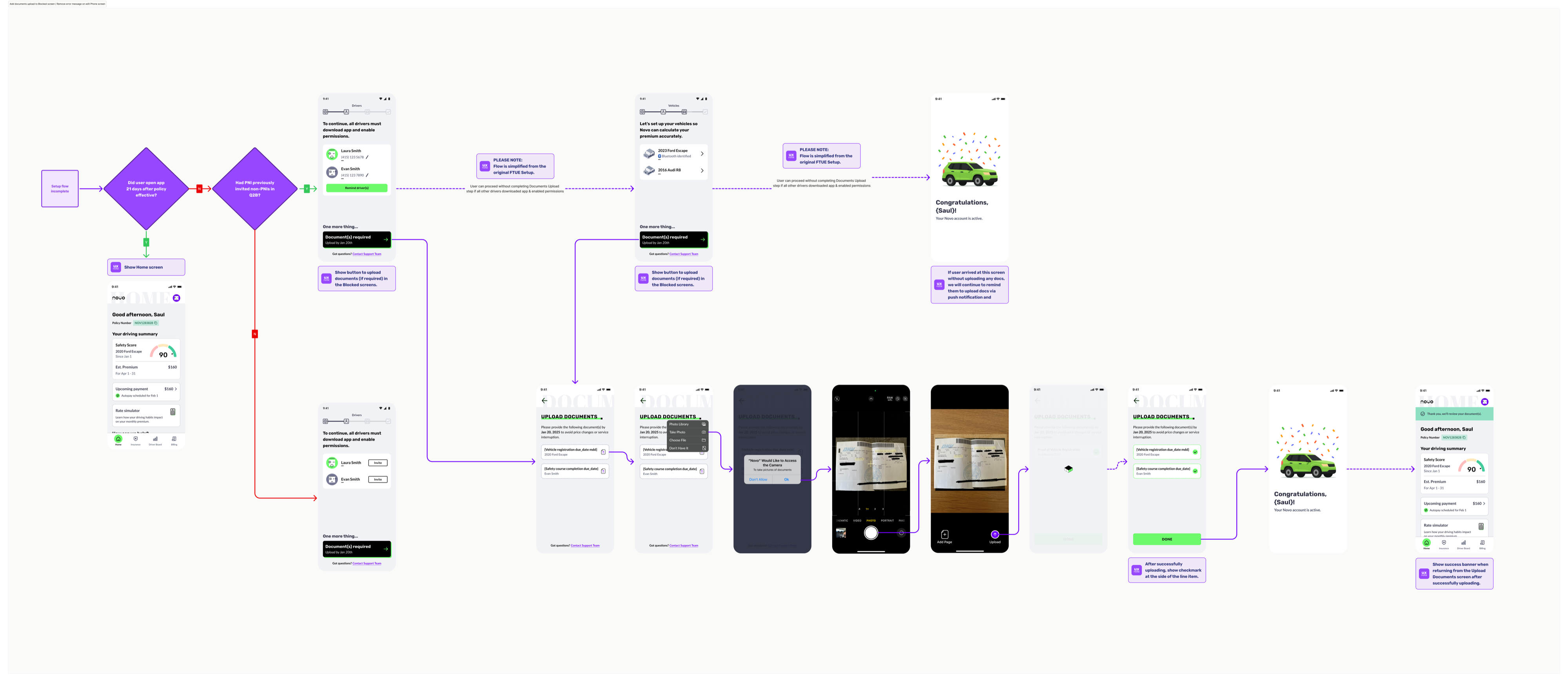
Because Novo is a telematics-based product, every driver on a policy must install the app on their own device and pair it to a vehicle. For single-driver policies, this is straightforward. But for multi-driver households, setup completion dropped dramatically, for a simple reason: you can't control what other people do.
The original design treated this as an individual task for each driver to complete independently. In practice, that meant most households never reached full setup. Under 10% of multi-driver policies completed the process.
My redesign introduced a gating mechanism: the primary policyholder, the person who signed up, can't access their insurance documents until every driver on the plan has completed setup. That single change restructured the incentive entirely. The primary driver now has direct, personal motivation to follow up with the rest of their household, placing accountability exactly where it belongs.
When you need multiple people to act, find the one person with the most to lose, and make sure they feel it. Gate the value behind full completion, and let peer accountability do the work.
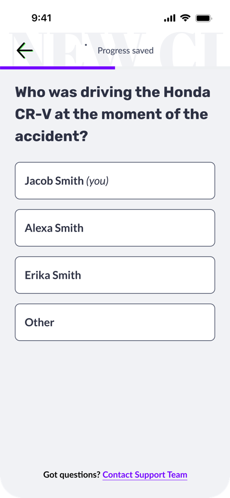
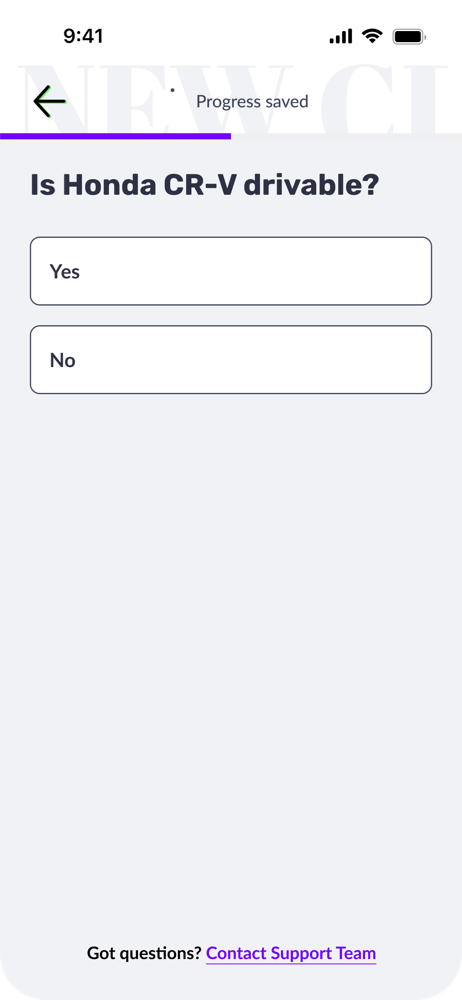
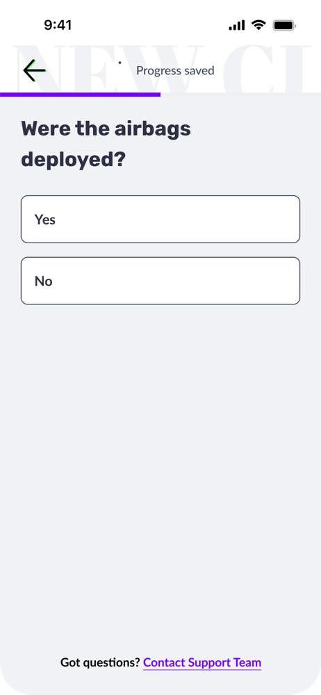
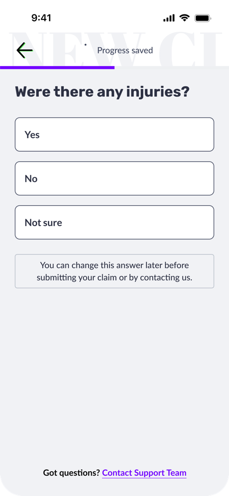
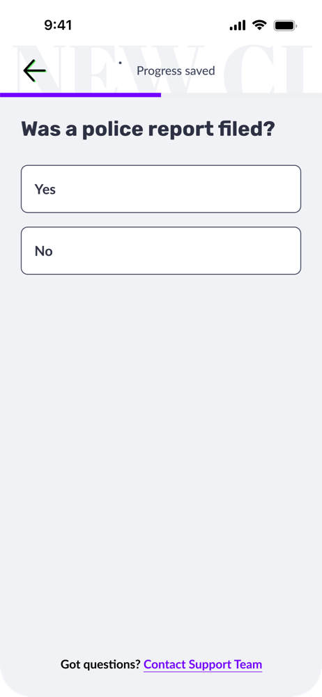
In-App Claims Filing
Filing an insurance claim is one of the highest-stakes, highest-stress moments in a customer's relationship with their insurer. Prior to this feature, customers had no in-app path: they had to call or email, navigate availability, and wait.
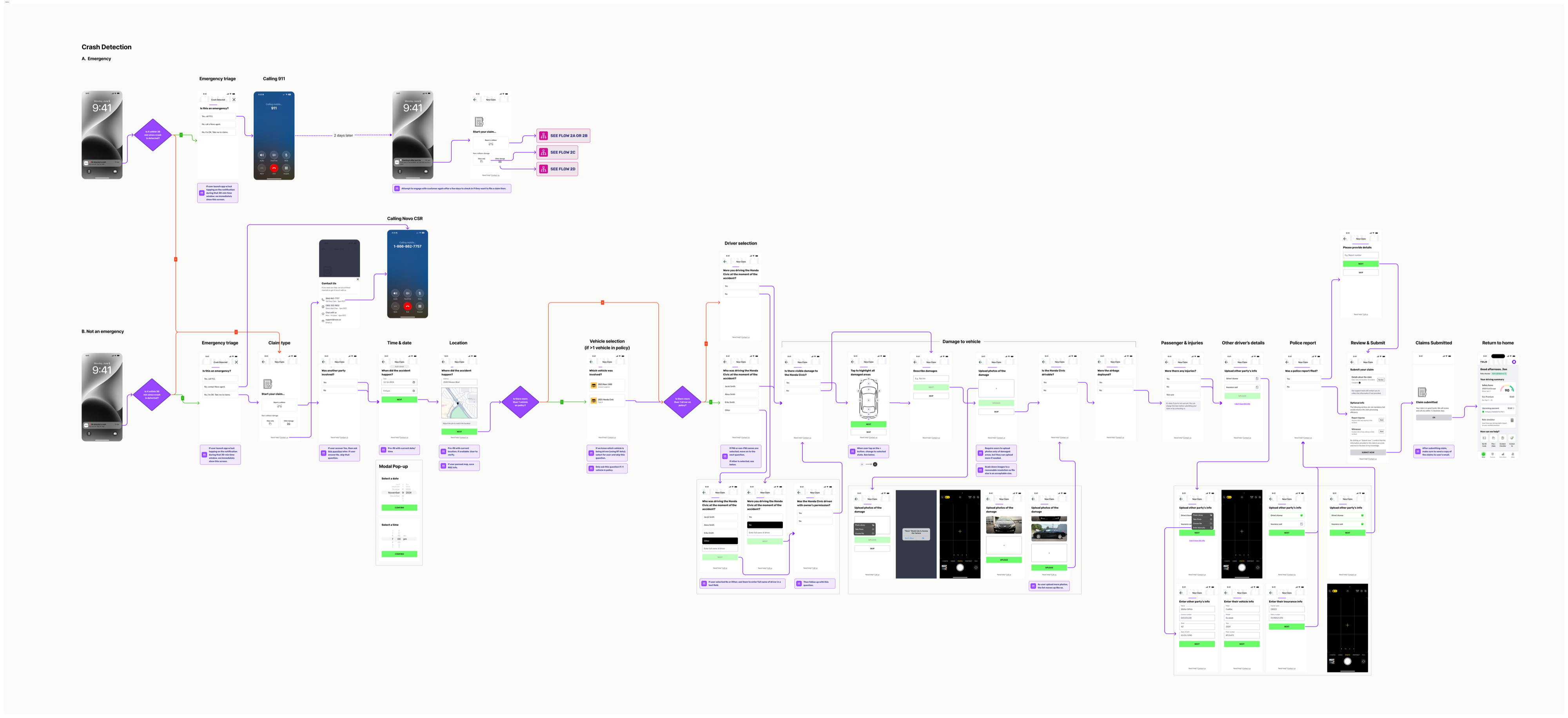
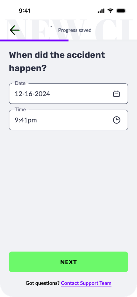
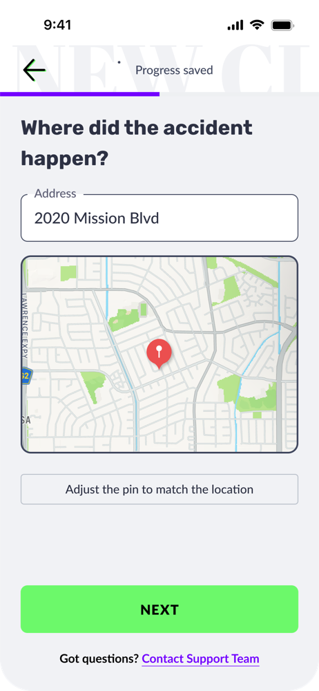
I designed a comprehensive end-to-end claims flow covering collision, glass damage, and other comprehensive damage. The experience begins with an emergency triage step that confirms the customer is safe and provides a direct path to emergency services if needed. From there, customers can connect with a CSR or proceed through self-service.
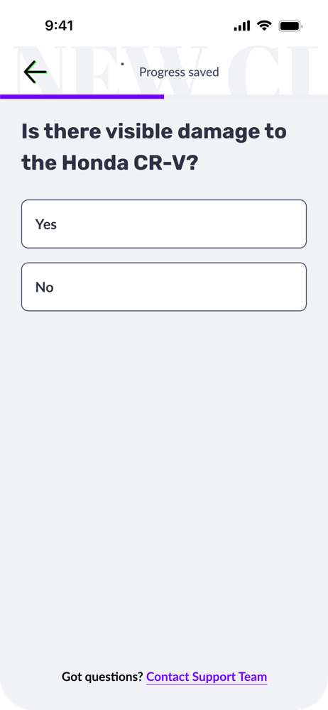
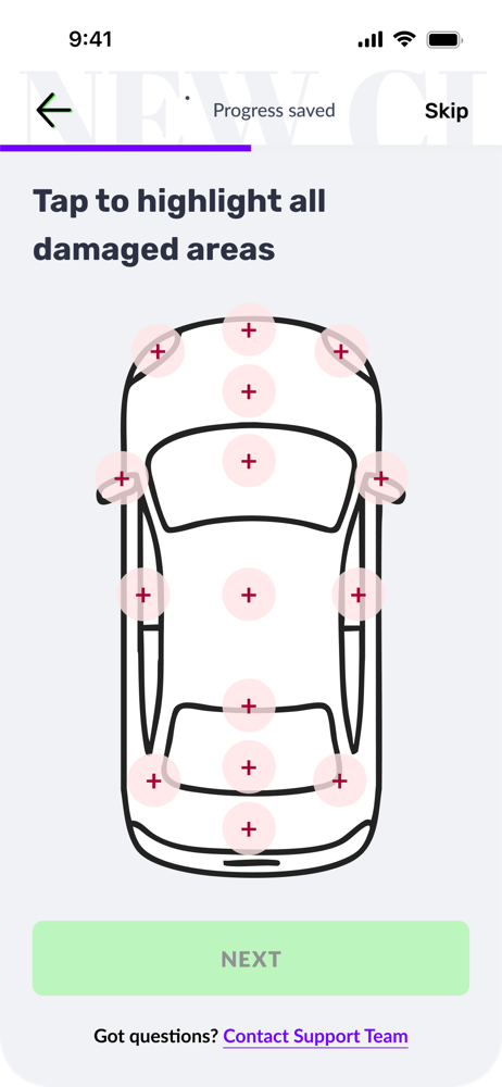
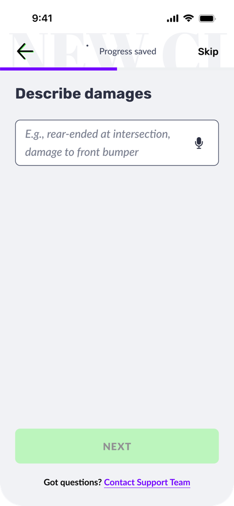
The self-service flow captures all necessary information:
After submission, customers can track their claim status directly in the app and receive an estimated resolution timeline, reducing the need for follow-up calls and setting clear expectations.
This feature is designed and ready for launch. Based on how the other self-service features performed, we expect strong results.
Throughout multiple rounds of design reviews, customer service representatives consistently reported that these self-service features meaningfully reduced their inbound volume of routine requests: document submissions, setup guidance, and status questions. Offloading those repetitive tasks lets CSRs focus on the complex issues that genuinely need human expertise.
Results that speak for themselves
These aren't incremental improvements. Each metric reflects a fundamental redesign of how customers move through a step, and the numbers show it.
What pulls users back?
Retention in an insurance app is a difficult design challenge. Unlike a social product or a game, there's no inherent reason to open an insurance app every day. Most apps in this category are opened reactively: when something goes wrong, or when a payment is due.
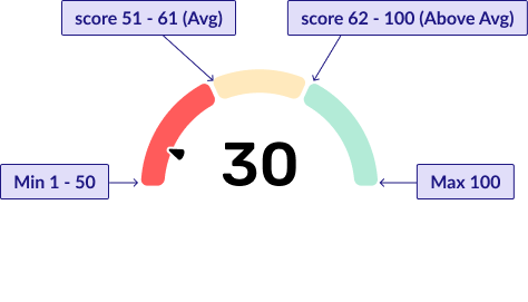
The Novo App works differently. The safety score creates a pull-based engagement loop: because the score updates with every drive, customers have a direct, ongoing reason to return. Did that commute help or hurt their score? How does this week compare to last?
That dynamic is reinforced by the personalized coaching layer. The more driving data accumulates, the more targeted the feedback becomes, surfacing a driver's specific patterns and weaknesses with actionable advice. The app doesn't just judge; it teaches. Over time, this builds a habit loop grounded in genuine usefulness rather than manufactured urgency.
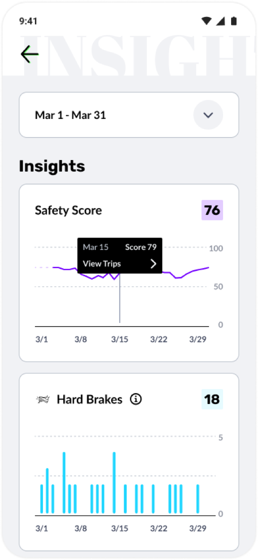
A safety score that changes every time you drive is a variable reward. The combination of real stakes (insurance premiums), real feedback (personalized coaching), and a visible number to improve creates a retention mechanism that doesn't feel artificial, because it isn't.
What worked (and what I'd revisit)
Across the board, the self-service model worked. Moving tasks from CSR-dependent outreach into in-app flows produced measurable step-change improvements every time it was applied. The pattern was consistent enough to become a design principle: if a task can be completed in-app, it should be.
The safety score loop worked well, but for a specific segment: customers who already drive safely. The retention numbers reflect that.
Known Limitation
The current experience is optimized for drivers who score well. For those who don't, the app risks feeling punitive: a constant record of what they're doing wrong. Negativity fatigue is a real risk here, and we don't want to push the customers most in need of improvement out of the product. It's a tension we've identified and are actively working to address.
The business model also has a natural selection effect: better drivers stay, worse drivers churn. While that's workable in the short term, it's not the long-term vision. The goal isn't to cream the best drivers; it's to help all drivers improve and be rewarded for it.
That's the challenge I'm exploring in the Good Miles project: how to use gamification and positive reinforcement to engage and retain drivers who are struggling, rather than letting the product implicitly push them away.